Using Value to create depth: Lesson 5 in Space Element of Art

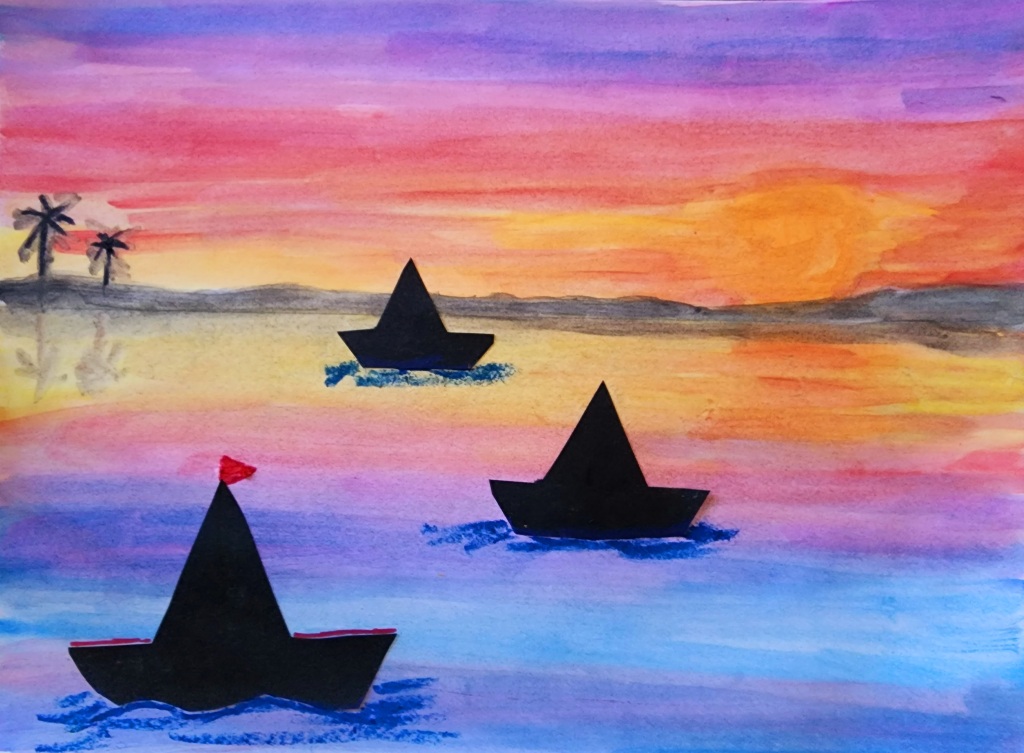
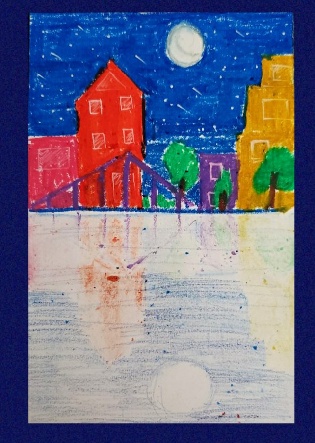
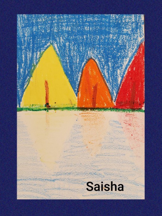
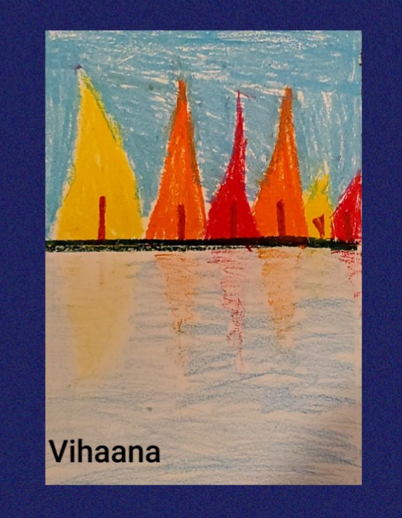
When defining your space on a 2-dimensional drawing surface, it might be a challenge to create depth. We need to have a foreground, middle ground, and background to create a sense of depth and distance. One way to differentiate and define this space is by using different values and details.

Let us first try to understand some of the terms that we would be using in this lesson.

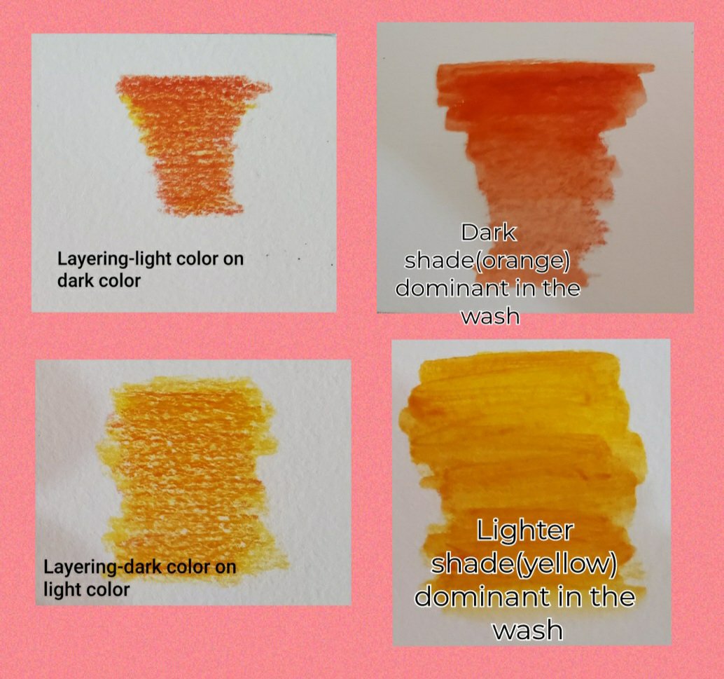
Value in art can be defined as the lightness or darkness of a color. In this lesson, we will create 7 values of a color. We will create 3 tints and 3 shades of a color Hue.

Hue- Hue is any color that you see on the basic color wheel. It means black and white are not hues whereas red, orange, yellow, green, blue, and purple are hues.

Tint- When we add white to any of the hues it creates a tint. Depending on the ratio of the colors that we mix we can create different tint.

Shade- When we add black to any of the hues it creates a shade. Depending on the amount of black that we mix with the hue we can create different shades of the same color.

Foreground is usually the main front of your picture. For defining this use a darker color, texture, and bigger size with a concentration on the details.

Background is the area that is the farthest from the viewer. Define this area with the lightest color, smaller in size, and fewer details

Middle ground is the area between the foreground and background!!

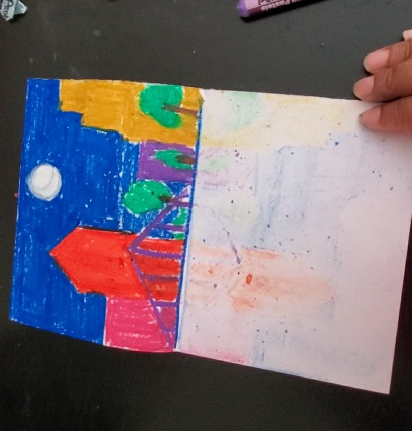
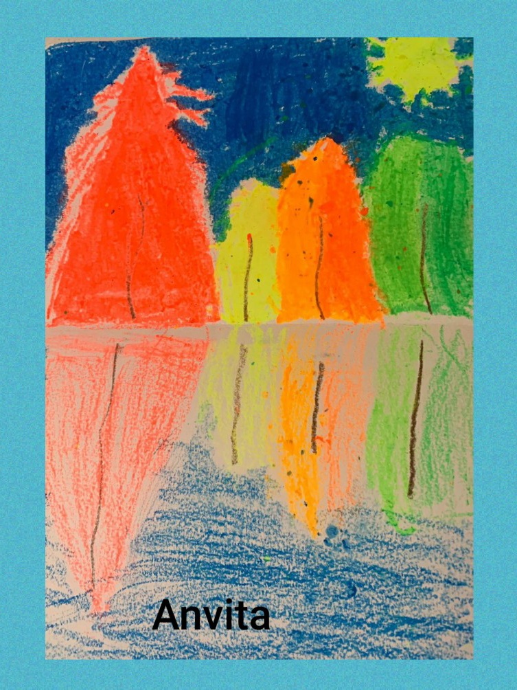
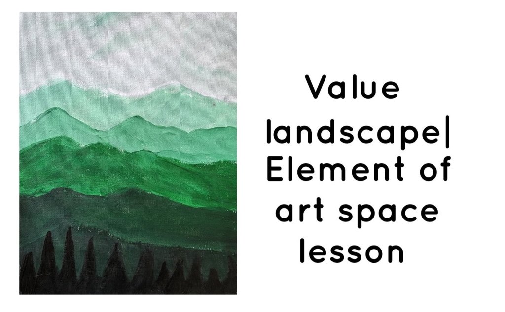
In this art project, we will paint a mountain landscape with trees that has a foreground, middle ground, and background.

Things needed:

1. Mixed media drawing paper

2. Acrylic paint- black, white, and a color of your choice and brushes

Step-by-step instructions:

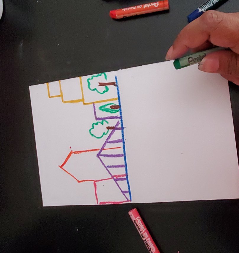
1. The first step is to create a simple landscape with 5 or more layers of mountains and some trees in the foreground( the bottom of the page.

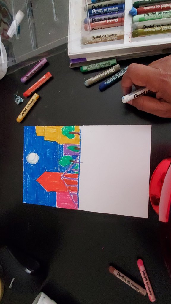
2. The next step is to create a range of colors from light to dark. For my project, I decided to create different values of green color.

3. Creating tinted colors- I am going to create three tinted values of green by mixing my green color with different amounts of white.

4. Next I am also going to create 3 shade colors of green by adding black to them.

5. Then I am going to apply my colors to my drawing.

The mountains in the background are going to be the lightest and I am going to paint them with my tinted colors.

The middle ground will have a medium value and I am going to paint it green from my paint tube.

For the foreground, I will use the darkest colors and use my 2 shades to do the mountains and the darkest one to paint my trees.

To watch this lesson on video follow along with the video :

Positive and Negative space- Lesson 4 in Space Element of Art

Space is the area around and within the subject of your art or you could say that it is the picture plane where your art is created. It can be said that it is a technique that creates an illusion of depth and volume on a flat surface of the paper.

We can classify space into two components: Positive space and Negative space.

Positive space is the main idea or subject of the artwork to which your eye is drawn whereas Negative space is the area around it.

In this exercise, we will learn about positive and negative space with an artwork where we will draw our hands as a positive and negative space.

The positive space will have details with line art using black permanent marker!!

Please follow along on Youtube to watch this lesson in video format or continue reading

Things needed:

  1. Two White mixed media paper
  2. One Black paper
  3. White colored pencil
  4. Black permanent marker
  5. glue and scissors

Steps to follow:

  1. Using your white colored pencil draw an outline of your hands on the black paper.
  2. Then create a neat cut out, so that you have a black hand shaped cutout and the paper around it creating a hand shaped hole.
  3. Stick each of these on the two white drawing paper.
  4. The black area is your negative space.
  5. So now you have one artwork with your hand as the positive space and another one with your hand as the negative space.
  6. I designed the positive area with some line art, but you can choose to do something else too!
Step 1 : outline of hand
Step 2& Step 3: Creating cutout and stick it on white paper
Step 2 and Step 3: Creating cutout and stick it on white paper
Step 5 and Step 6: Adding a line art to your positive spaces( white area)

One-point perspective -Lesson 3 in Space Element of art

One of the most important ways to emphasize Space is using Linear perspective on 1 point perspective.

Some of the terms that we will use to understand this concept are Eye-level, vanishing point, parallel lines.

In this exercise, we will draw a Treasure Chest in a One-point perspective. But before we do that, let’s understand the terms that we are going to use.

EYE LEVEL: Eye Level is similar to the horizon line and it is the height of the viewer’s eyes when looking straight ahead.

PARALLEL LINES: Parallel lines are lines that would never meet regardless of how far you extend them. The distance between 2 parallel lines will always remain the same and hence they would never meet.

Vanishing point: The vanishing point is the fictional point that appears to be the furthest from the viewer or in other words, is the farthest point up to which the viewer’s eye can see.

In perspective drawing, all parallel lines appear to converge towards the vanishing point creating an interesting composition. For example, when you are driving on a freeway and you are looking ahead the road seems to converge to a single point in the distance!

Now, that we have some idea of the terms, let’s actually try to draw something from a one-point perspective.

Steps:

  1. We will start by drawing an eye level horizontal line( parallel to the horizontal side of your paper) and a dot on it( vanishing point).
  2. Next any where on the paper draw a square or rectangle. The sides of your square or rectangle needs to be parallel to the sides of the paper.
  3. From each corner of the square draw lines that meet the vanishing point.
  4. Now draw 2 more parallel lines( to the vertical and horizontal sides of the box and touching the converging lines ) as shown in the image below to create a box shape.
  5. Add on curved sides on the top to give it a treasure chest shape.
  6. Erase the guidance lines.
  7. Add details on the box to create an interesting treasure chest look.

If you would like to watch it as a video lesson please follow the link below:

Placement in relation to Horizon and Size of the object: Lesson 2 in Space Element of art

An important way to create a sense of space in your art is the use of horizon line or eye- level.

Horizon line- It is a visual boundary that you would draw across the plane of paper when you want to separate the sky from the land or water body.

Eye-level- This is also the same concept as horizon line except we use this term more often when we are working with indoor objects,  for example, the line that would separate a table from the wall when you are drawing a vase on the table.

Another way to create a sense of space is the size of the object, the object that is further away from you is going to look smaller even if they are actually the same size!

Things Needed:

  1. Mixed media drawing paper.
  2. Black construction paper
  3. white crayon to draw on black paper
  4. ruler, scissors and gluestick
  5. watercolors

Steps to follow:

  1. On your black construction paper draw 2-3 sailboats. Make the sailboats different sizes. Keep in mind that you are going to stick these on your drawing paper. So don’t make them too large
  2. Next using your scissors cut out these boats and keep them aside.
  3. Now its time to paint the landscape. The first thing to do is to draw a horizon line separating the sky from the sea. I am going to paint a colorful sunset with my watercolors.
  4. Wait for the painting to dry. Next we are going to stick the sailboat cutouts on our paper.
  5. When sticking, the smallest boat is nearest to the horizon and as we go further from the horizon line and come closer to the bottom of the paper, the boats will look bigger, showing that they are closer to the viewer!
  6. Using a n oil pastel or crayon add some water lines under the sailboats. Your artwork is ready to be displayed!

If you would like to watch this lesson as a video please follow the link below:

The Overlap Project: Lesson 1 about Space Element of Art

Overlap is an important way to create an understanding of how space is created on a 2-dimensional art surface. Overlapping helps create an illusion of depth on a 2-dimensional surface. Overlap is the concept where you have an understanding that the object in the front will disrupt the view of an object that’s at the back or in other words the object at the back can hide behind the object at the front so that a part of the object is not visible.

In this project, we will create some fishes in the overlap. We will create 3-5 fishes on our art paper, making sure that at least one pair is in the overlap. We do this by making sure that 1 of the fish is hiding partly behind another fish. We will create a fish stencil using an index card or a 3×5 inch size card stock paper. Then we will use this stencil to create 3-5 fishes on drawing paper. We will create Line designs on these fishes using colorful oil pastels. Then we will paint the background or the negative space using watercolors.

Follow along step-by-step to make this Art Project.

Things Required:

  1. Drawing paper ( at least 8×10 inches Size)
  2. Card stock or index card 3×5 inches
  3. Scissors
  4. Black permanent marker
  5. Oil Pastels
  6. Watercolors

Steps to follow:

  • On the Index card draw the contour( Outline ) of a fish in such a way that it covers most of the paper. Check out the picture below to see how the drawing should look.
  • The next step is to carefully cut out the fish using your scissors. You have created your fish Stencil.
  • Use your Fish stencil and trace around on the drawing paper. You can place your fish anywhere you like. After drawing your first fish, draw the next fish in a way that part of it is hiding behind the first fish. This is called an overlap. Keep in mind that you do not need the trace the parts that will be hidden behind the first fish.
  • Keep adding more fish; make your composition interesting by making the fish going in different directions! You could also add a fish in a way that half of it is going out of your drawing paper!
  • Use a Black Permanent markerto outline your drawing. Then using Oil Pastels or crayons make some Colorful Patterns on your fishes. You can color the rest of the area using Watercolors

If you would like to watch this lesson as a video follow the link below:

Oil Pastels for Little Artists

Oil Pastel is an art medium that has been probably introduced to every kid in an elementary school art lesson. It is softer and better than regular crayons as they have brighter colors when applied properly and because of the wax or oil in them they spread much easily than a regular crayon where you have to press really hard to make sure that all your white spaces are colored.

But because of the oil texture, it can become messy if not handled properly. In this post I will show how to handle Oil pastels properly if you are an absolute beginner.

Some basic tips to help you get started

  1. Keep a paper towel or rag towel handy with you so that you can clean your hands often. You do not want the paint from your hands transferring on to your drawing paper.
  2. Every time you blend two or more colors on a surface, make sure that you use a paper towel to clean the oil pastel stick after use.
  3. You can use a blending stump or stick, a paper tissue, a Q-tip or even your clean fingers to blend and smoothen colors. ( Side Note: Professional ones do blend better and have a creamier texture than student Oil Pastels, but I would not recommend a professional quality oil pastel for beginners or kids; Student quality ones are really affordable whereas professional ones are really expensive)
  4. Choose your colors wisely while blending colors together, otherwise you will end up with a muddy mess. You can even try out on a scrap paper before applying it to your actual artwork.
  5. Always layer or blend with at least two to three colors when using oil pastels, but while choosing the colors for blending avoid colors that are on opposite side of the color wheel.
  6. Do not keep touching your art while you are working. You may cover up the areas that have been colored using a paper while working on the other areas. This will prevent the paint from transferring to your hands and to the other parts of your artwork and making it messy.
  7. Always cover your artwork with a newspaper while storing. You may also get a Fixative spray to spray on your finished artwork to prevent it from smudging.
  8. Oil Pastel artworks need to breathe, so do not frame them in glass frame with no room for air.
  9. You need to use a thick paper for applying the thick layers of oil Pastel colors. Though I usually use mixed media paper for doing my artwork, you also find Oil Pastel Paper pads that come in different shades rather than just plain white paper.

Few Beginner techniques to get you started

1.Tint. Adding White to a color to make it lighter. Start with any color and then blend it with white to make it lighter.

2. Shade. Adding Black to a color to make it darker. I usually start with black( apply the black very lightly ) and on top just apply the color of your choice and blend it together.

3. Tint +Shade. Gradation from lighter shade to the darker shade. Start with a tint and then move on to the base color and then add the shade. Lighter to darker.

4. Light Pressure blend. Blend or mix 2 or more colors with a light pressure using your fingers, paper tissue or a blending stump

5.Heavy Pressure blend. Blend or mix 2 or more colors by applying heavy pressure using fingers, tissue or blending stump

6.Stippling. Start with a lighter base and then layering it with a group of dots using a darker color

7. Scumbling. Scribbling in circular motions with multiple colors to make a texture

8. Scraffito. Starting with a color (light or dark) and then scratching it with something to make texture or design.

9.Flicking-Dark on light. Start with a lighter base and draw lines on top using 1 or more darker shades with flicking motion

10. Blending using solvent. Using a baby oil or mineral spirit to blend the colors

Keeping in mind all the above tips, try out this simple flower at Sunset using oil Pastels

Watercolor Pencils for Little artists!

What are Watercolor pencils?

Watercolor Pencils look very similar to regular colored pencils, but you can activate it by adding water to create a soft blended look. They can be used very well to create your base drawing for a watercolor painting and also to add finer details or to do your whole painting!

Advantages

  • Watercolors can be difficult to handle, especially for children because most of the time they end up adding too less water or too much water. Watercolor pencils on the other hand can be easier to control. You may draw your artwork with your watercolor pencils like you would do with a regular colored pencils( applying lighter and darker shades, layering with different colors ) and then when you are satisfied add a bit of water at a time to blend it in.
  • The second advantage is to be able to sketch your idea especially if you are planning on painting something with a lot of details.
  • You can also use it to add finer details to your finished painting with much ease.
  • The next advantage is that it is easier to maintain. You don’t have the hassle to clean your brushes every time. You don’t have to invest in expensive brushes. I usually use a size 6 or 8 round brush. But what I really like is watercolor brush pens. I just fill it in with water and I am good to go!

That being said, is watercolor pencils a replacement to traditional watercolors? The answer is : NO! But still it a good way to begin and get used to the idea of watercolors for young artists.

Watercolor pencil Techniques

I am going to try some basic beginner techniques using watercolor pencils, some of them are very similar to what we would use for regular watercolors!

  • Creating Washes

We will do four different kind of washes: The colors I used are Orange-Red and a bright Yellow from my Arteza Watercolor Pencil set

  1. Flat wash – To create a flat wash I used my Orange-Red and colored it evenly with medium pressure through out; next I used my round brush and some water to blend it in to create an even shade of orange.
  2. Gradient wash- To create my gradient wash I used my Orange-red and started coloring with heavy pressure and gradually decreased my pressure as I went down so that I have a gradient value of lighter to darker. Then I started blending from the lighter part to darker part to create my gradient wash of orange.
  3. Layered wash ( light on dark)- To create this wash I started by coloring with my orange -red( darker shade) and then layered it on top with my lighter shade( yellow); then I blended it with water. This created an Orange-yellow shade with Orange as my dominant color.
  4. Layered wash ( dark on light)- To create this wash I started with my yellow( lighter shade) with heavy pressure and then layered it on top with my Orange-red (darker shade) with medium to light pressure; then I blended it with water. This created a yellow-orange shade with yellow as my dominant color.
  • Dry-on-Wet and Wet-On-Wet Techniques
  1. Dry-on-wet: In this technique, we will first wet our watercolor paper with water, then go on top with our dry watercolor pencil.
  2. Wet-on-wet: In this technique, we will first wet our watercolor paper, then wet the tip of our pencil too and ten use the wet pencil on our wet paper.

These seem to work very similar to usual watercolors but, the color pigments are visible clearly unlike regular watercolors.

  • Variegated wash In this technique, you use multiple colors blending them in when one color meets the other. There are two ways to try this using watercolored pencils: 1. Adding the first color, blending it with water and while it is still wet, start at the bottom with your 2nd colored pencil! (Dry on Wet)

2. Add the first color, then add the second color at the bottom mixing it where they meet and then blend the colors using water.

  • Scumbling In this technique, you make random patterns with single or multiple colors to add interesting texture. I am going to apply my first layer and blend it first. Then on top I am going to add my random scumbling texture with my dry colored pencil.
  • Flicking In this technique, you make lines by starting off with heavy pressure and flick up so that the pressure decreases at the end of the line, thus creating lines which are thicker at the bottom and get thinner as you go up. This is a great technique to create grass texture and much easier to do with watercolored pencils rather than using traditional watercolors.

Painting reflections on water using Oil Pastels

Adding reflections to any art makes it look more realistic by adding more dimension to your art.

In this post I will show you an easy way to add reflections to your drawing!

We start the lesson by explaining how the reflection of a vertical object on a flat reflecting surface would be almost the same size as the original object and so when you see your reflection on a water source like a stream or river it appears to be an upside down version of you!

We will use this understanding on a piece of paper by folding the paper into exactly half and then we use the upper half to make the original image and the lower half will be the reflection( on water) of the upper half.

We made 2 Oil Pastel paintings :

  1. Fall trees on a Lake
  2. A cityscape at night time

The things we need for this project are:

  1. An art Paper or a printer paper .
  2. Some Oil Pastels to draw the image
  3. A popsicle stick or palette knife or any plastic knife( you may use your nails too 🙂 )
  4. A light blue crayon( Optional)
  5. Some White or silver Acrylic paint with a thin brush Or Acrylic Marker pens to add some additional details (Optional)

STEP-BY_STEP INSTRUCTIONS

Below is a step-by-step instruction with pictures for doing a night time cityscape with reflections on the river!

  • Fold your drawing paper into a half, now hold your paper so that the folding line is horizontal. The top half is your object that you need to draw and the bottom half is your reflection.
  • On the top half, use oil pastels to draw and color your picture.
  • Now fold and close your picture.
  • Now rub the white part using a palette knife or a popsicle stick; use your energy so that the paint on top part gets transferred to the bottom half of the page.
  • Now open up your drawing to make sure that the paint transferred evenly, if not repeat Step 3 and 4 again.
  • OPTIONAL STEP: Now using your light blue crayon to add some color to the left over areas( if any) at the bottom half of paper( to make it look like water).
  • OPTIONAL STEP: For the night sky, you may use some acrylics or Acrylic marker to add some shooting stars on the sky!

Not a big reader? Watch the quick Video:

Check out the student artwork at our Thursday group reflections lesson!

Learn to draw Emotions

In this lesson, we will learn how to draw faces with different expressions or Emotions. For each emotion, we will draw an emoji and a more realistic human face.

We will draw basic human emotions: Happiness, Sadness, Surprise, Scared, Anger,Disgust

The facial features that we need to consider while drawing each emotion:

  1. Eyebrows
  2. Eyes
  3. Nose
  4. Mouth

We need to draw each of these features a little differently for each expression.We will start by trying to express each emotion on an emoji face. Let’s see how!

Happiness

Large eyes, arched eyebrows and lips up

Sadness

Eyes down, eyebrows in inverse curve, lips or mouth down

Surprise

Eyebrows raised up in a curve, eyes wide open and mouth open in circle

Anger

Eyebrows like an upside down V, eyes open wide( or alternatively make them squinted), lips narrow and to the side

Scared

This looks like a mix of sadness and surprise, with eyebrows upside down, mouth corners down like an arc and wide eyes.

Disgust

Narrow squinted eyes, eyebrows lowered sideways,Mouth down in a frown or a “blehh” expression

Once we figure out how to express each emotion using emoji face, we will draw each of these expressions on a human face concentrating on each of the features.

Below is the facial expressions corresponding to the emojis; use the emojis as a guideline to draw the actual human face!

Large eyes, arched eyebrows and lips up -HAPPY

Eyes down, eyebrows in inverse curve, lips or mouth down SAD

Eyebrows raised up in a curve, eyes wide open and mouth open in circleSURPRISE!

Eyebrows like an upside down V, eyes open wide( or alternatively make them squinted), lips narrow and to the side -ANGER

Narrow squinted eyes, eyebrows lowered sideways,Mouth down in a frown or a “blehh” expression-DISGUST

This looks like a mix of sadness and surprise, with eyebrows upside down, mouth corners down like an arc and wide eyes.-SCARED

Below is a slideshow of the artwork done in class by the students, some of them have colored the human faces and to add some exaggeration they have added some colors to the face based on the expression which is a fun Art way to express the feelings !!

Let’s Go on a Safari/Animals Portraits at the Zoo :)

The first thing that comes to our mind when we say Safari is probably the African Safari!Going to the Zoo is something all kids love!But Safari is a total different experience, where you get to watch these beautiful animals in their natural habitat!

My little ones always tell me all the fun facts that they have learnt or read somewhere about ! To be honest, they know more about them than me! It always has me impressed that they can retain so much information from what they read or have watched on some videos! I guess you remember more if you are learning about them just for fun rather than for a taking a test!

So this week we decided to learn to draw some Animals Portraits that we like to watch in a Zoo or on the Safari! We concentrated on drawing the portraits with Focus on their Facial Features. We can also do the same thing with favorite pets!

The first 4 animals that we are going to draw are a PANDA,TIGER, BEAR and a MONKEY! For these four animals, we will start with circle for the faces.

Follow the directions step-by-step to draw the animals!

STEP1: Start with 4 Circles

STEP 2: Make your ears for all the four animals

STEP 3: Draw the eyes.

STEP 4: Draw the nose

STEP 5: Draw the mouth.

STEP 6: Add some fur and hair!

STEP 7: Draw the body and add the details to finish your drawing!!

The next 4 animals that we are going to draw are a LION, a PENGUIN, a GIRAFFE and an ELEPHANT.

STEP1: Make the outline shape of the animal faces.

STEP 2: Add the ears.

STEP 3: Add your eyes.

STEP 4: Add the nose/beak.

STEP 5: Add the mouth.

STEP 6: Add the body and details to finish your drawing!!

And just like that we made 8 animal portraits!If you like colored versions, go ahead and add some colors!!

You can try the same lesson with favorite pets too!!


Learn to draw curves using straight lines

Curved lines play a very important part in fine arts especially if you are drawing something from nature like animals, trees, flowers or maybe a person. Mostly we try to draw using contour lines where we follow the outline trying to match the shape of the object.

It can be very hard to be proficient in this technique and might take years of practice, it can be frustrating especially for little artists:) and to avoid that we can use this simple technique where we join multiple straight lines to form a curve!

Take the flower vase picture above for example, even though the picture hardly has any straight lines, we can still identify a bunch of major straight lines that can be smoothened to give it the soft effect!

Also check out how to identify the following cat portrait into a bunch of straight lines joined and smoothened together!

So, we basically, would draw using a bunch of straight lines and then smoothen out the edges where the lines meet to give it a natural look!

Take the example below to see how I used geometric shapes and straight lines to draw a cute little duck!

Check out the video below to learn more on how to draw like this!!

Even though, this technique might also take some time to master, it is definitely easier than doing contour or outline drawings, especially for complicated pictures!

Keep practicing and enjoy your Work because there is no wrong answer in Art!!