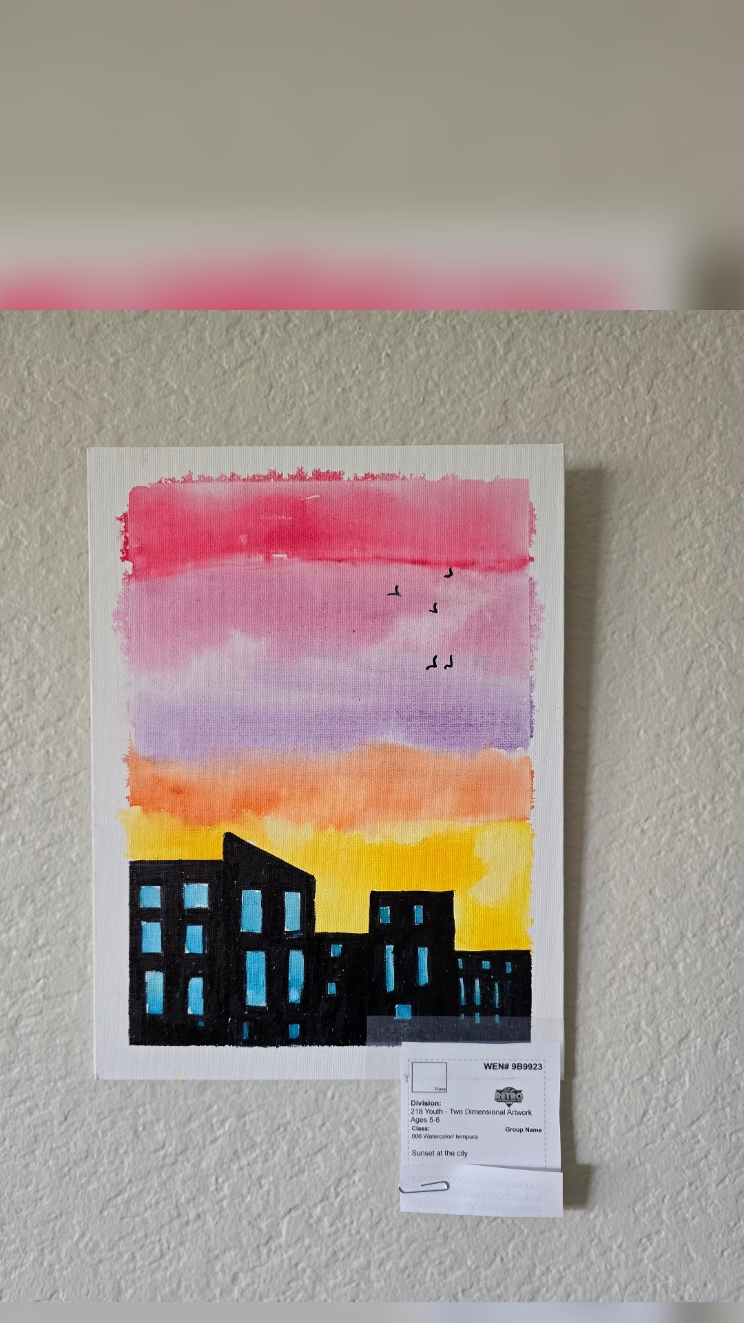
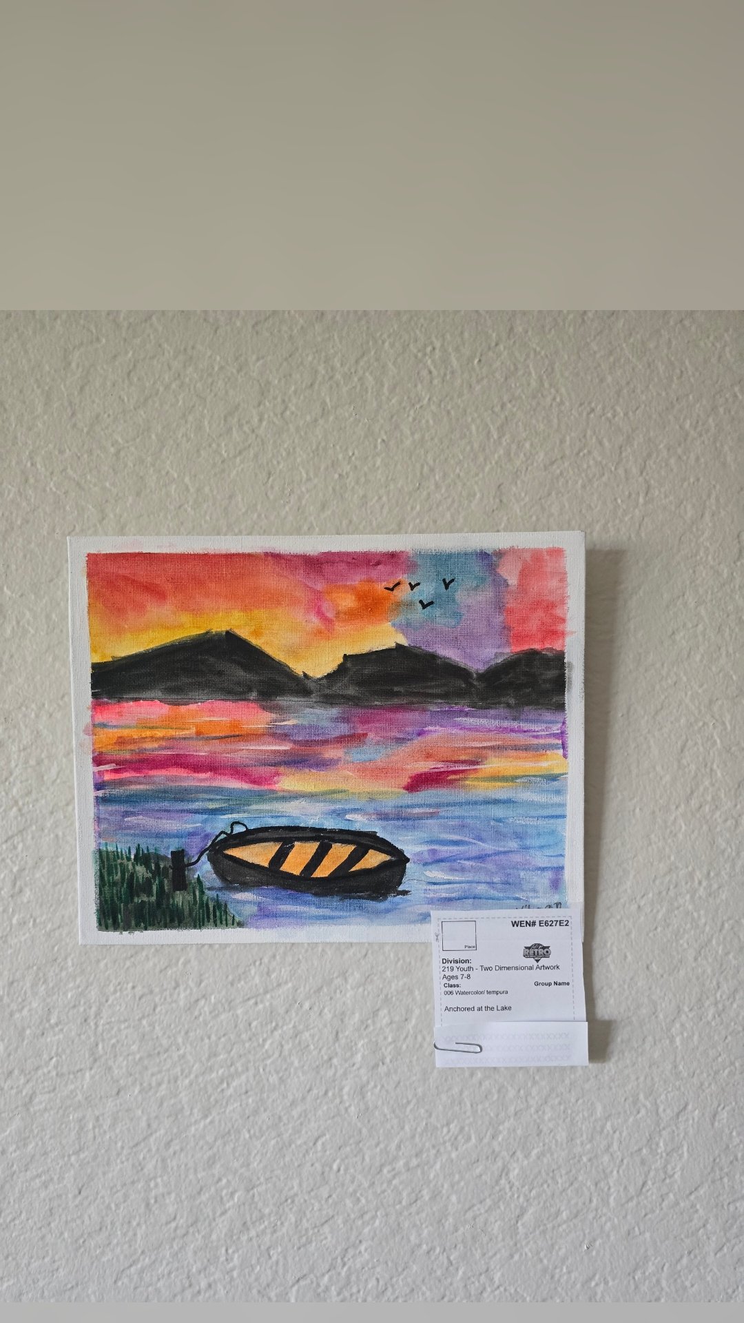
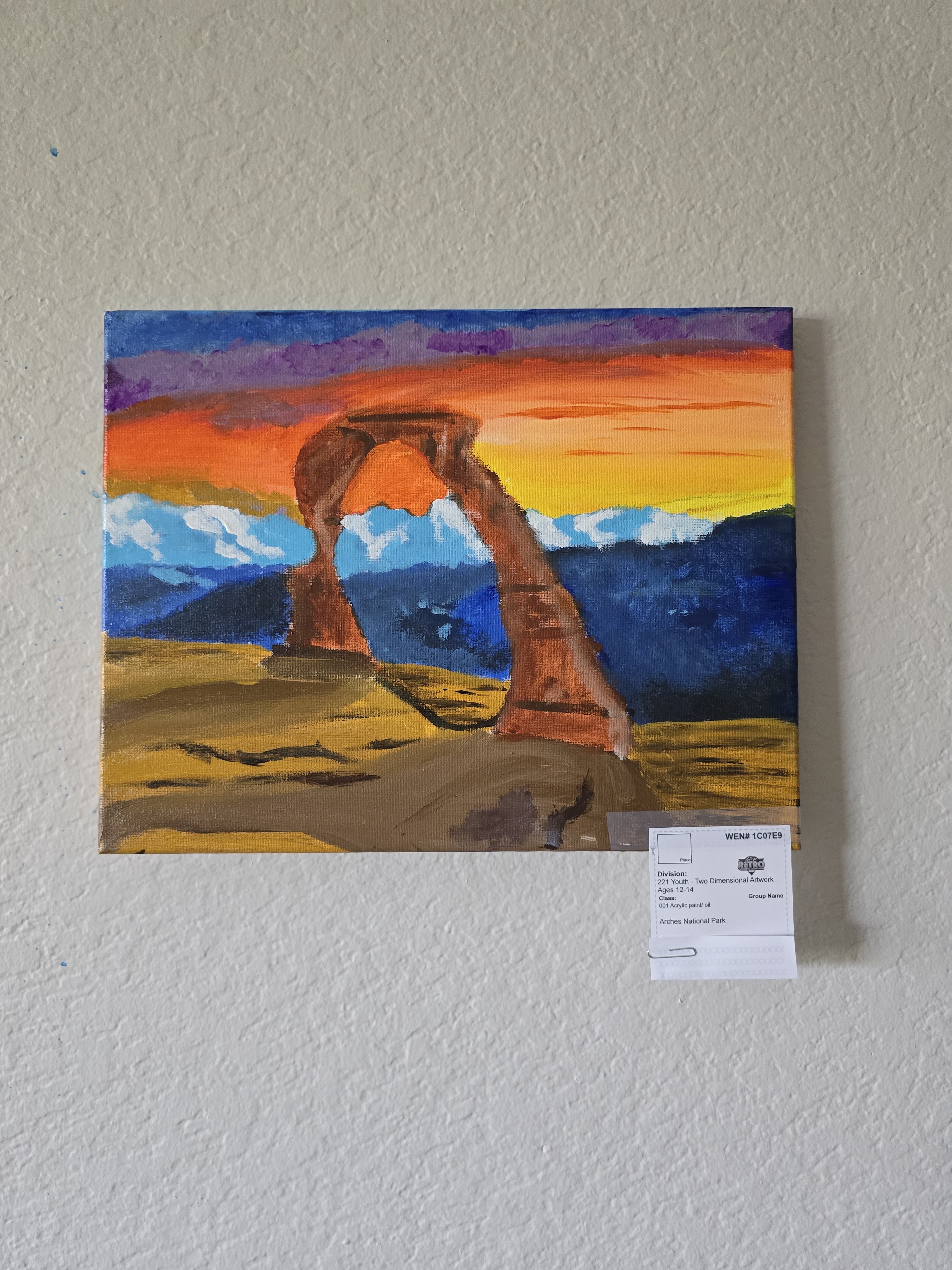
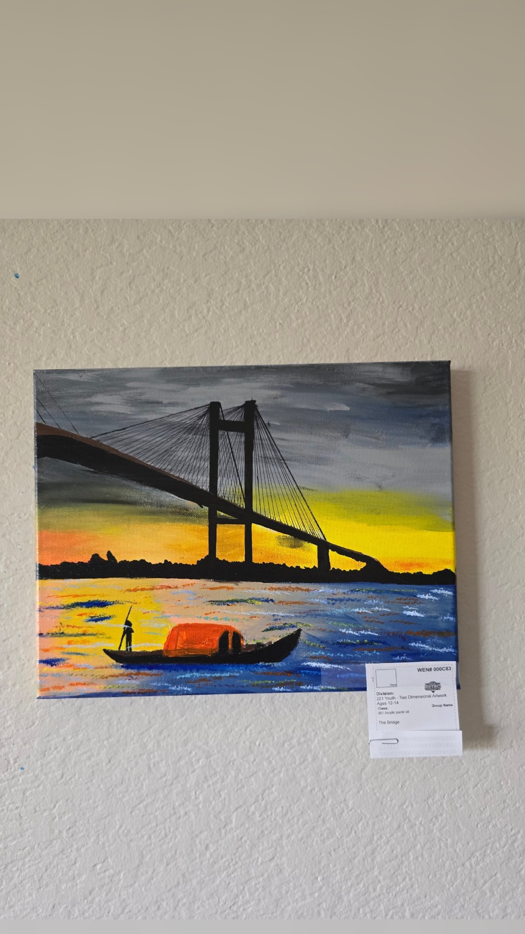
We are excited to participate in the San Diego County fair Youth 2D- art exhibition. We have 20 entries, by 19 students, and I am proud of the work they have exhibited.
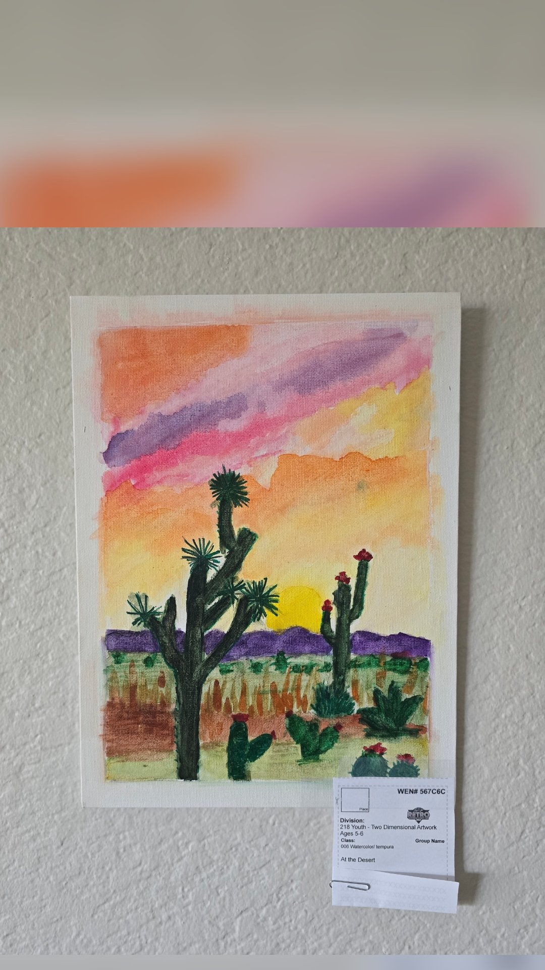
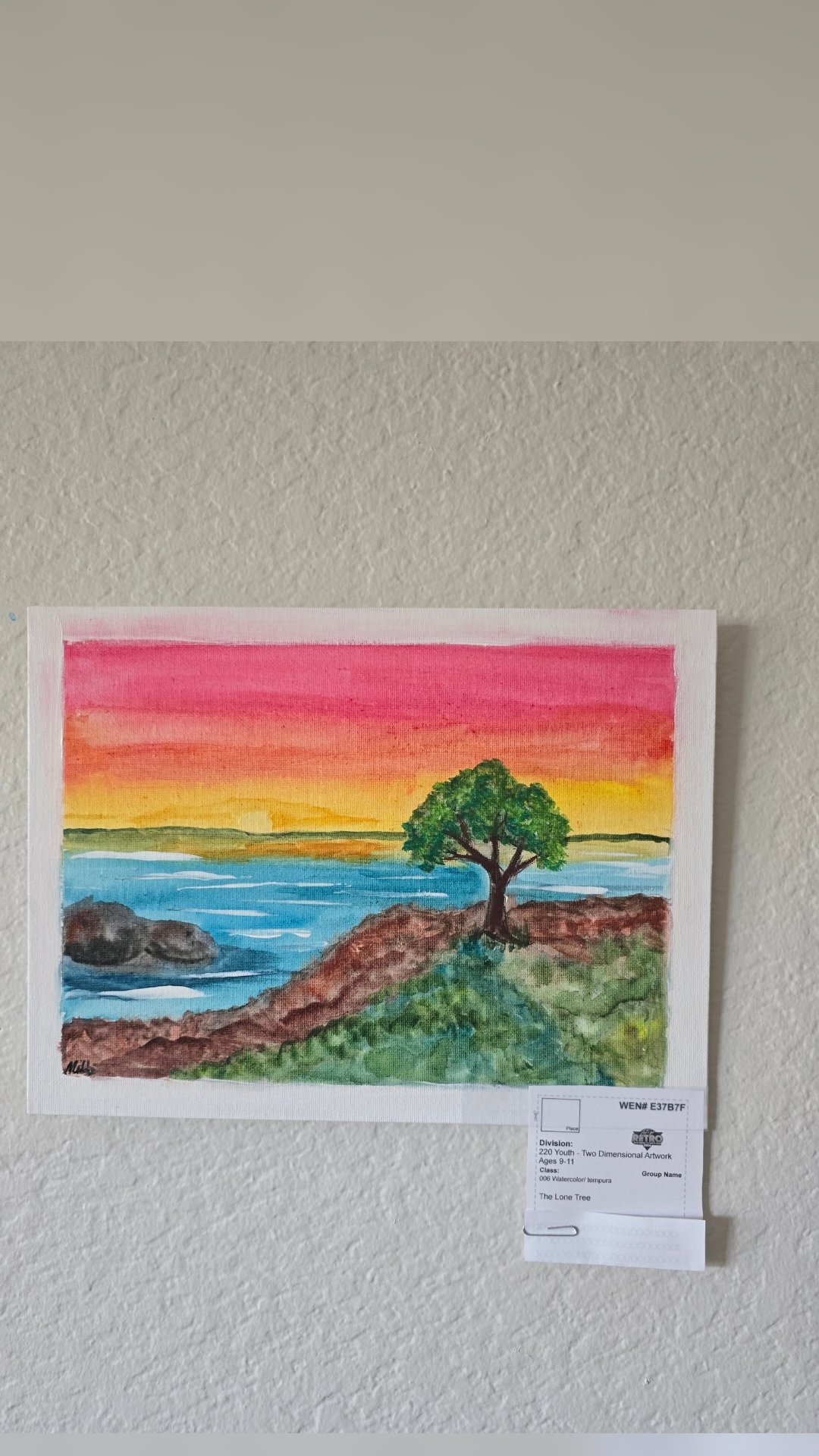
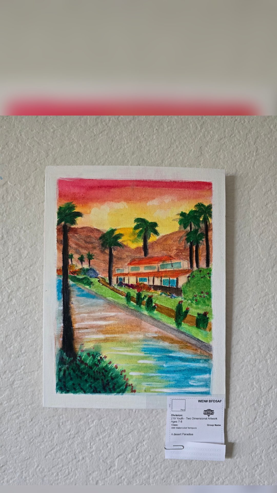
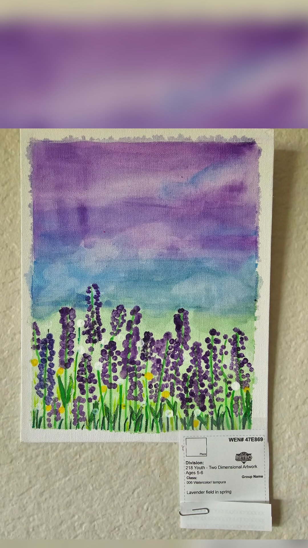
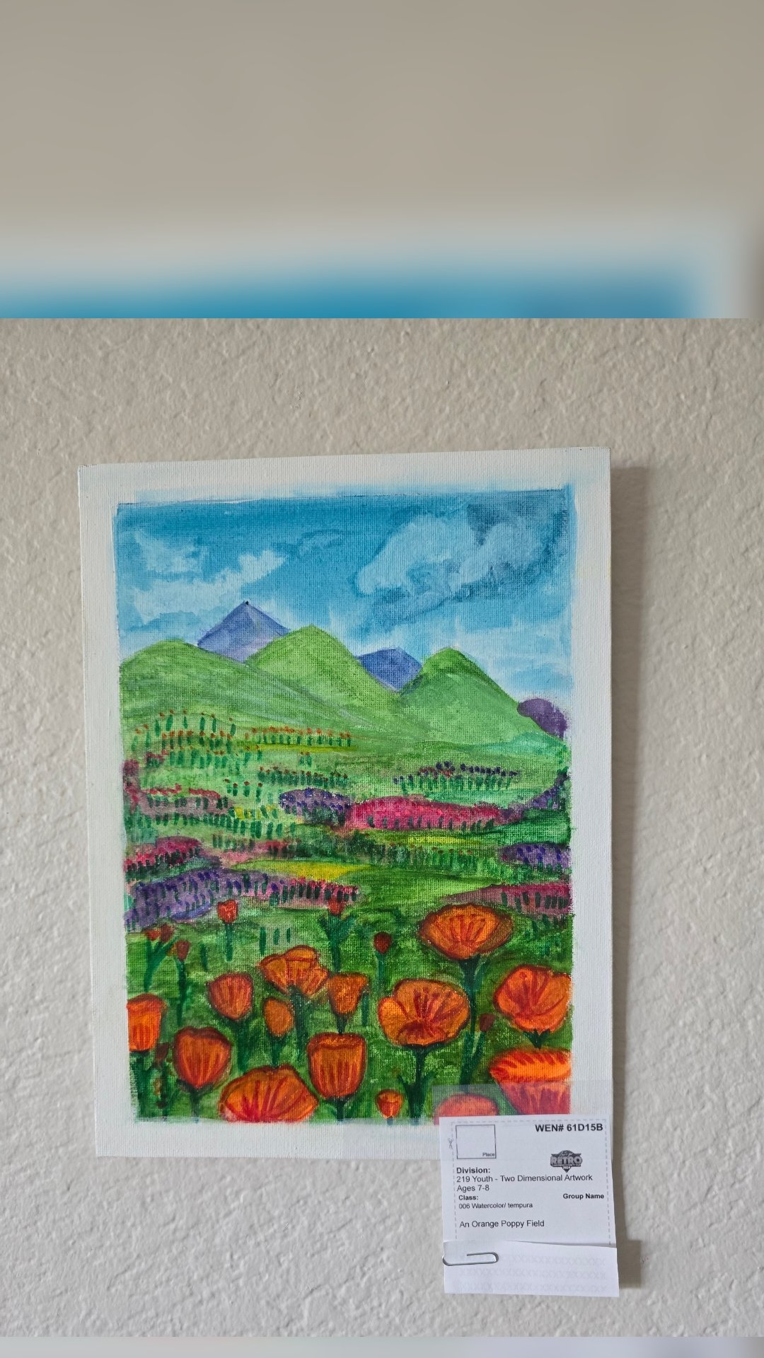
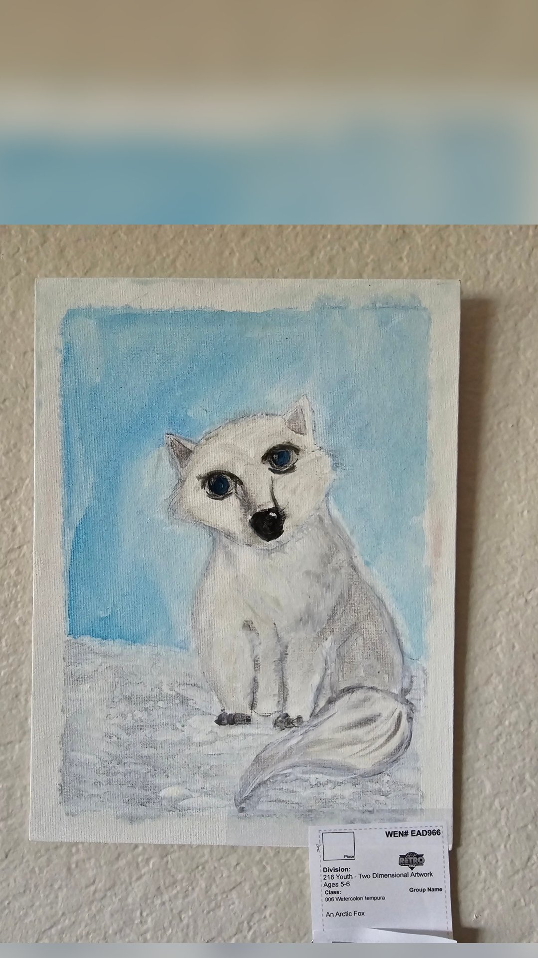
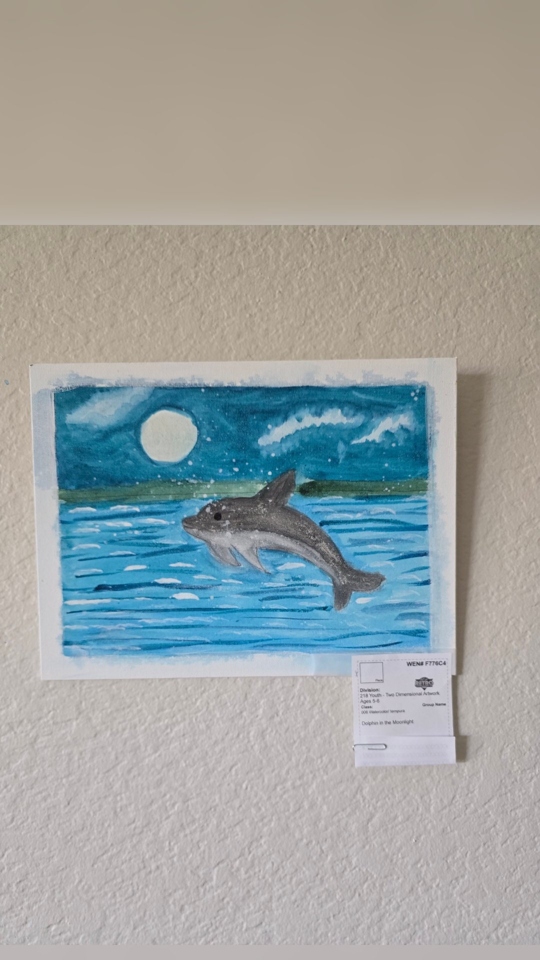
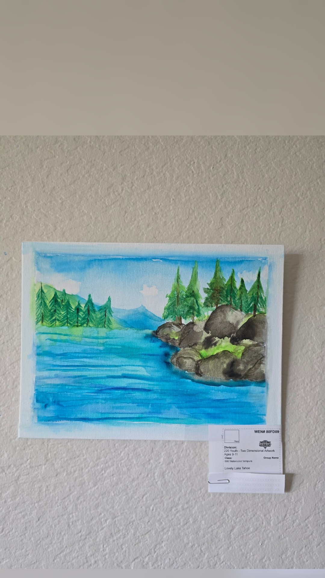
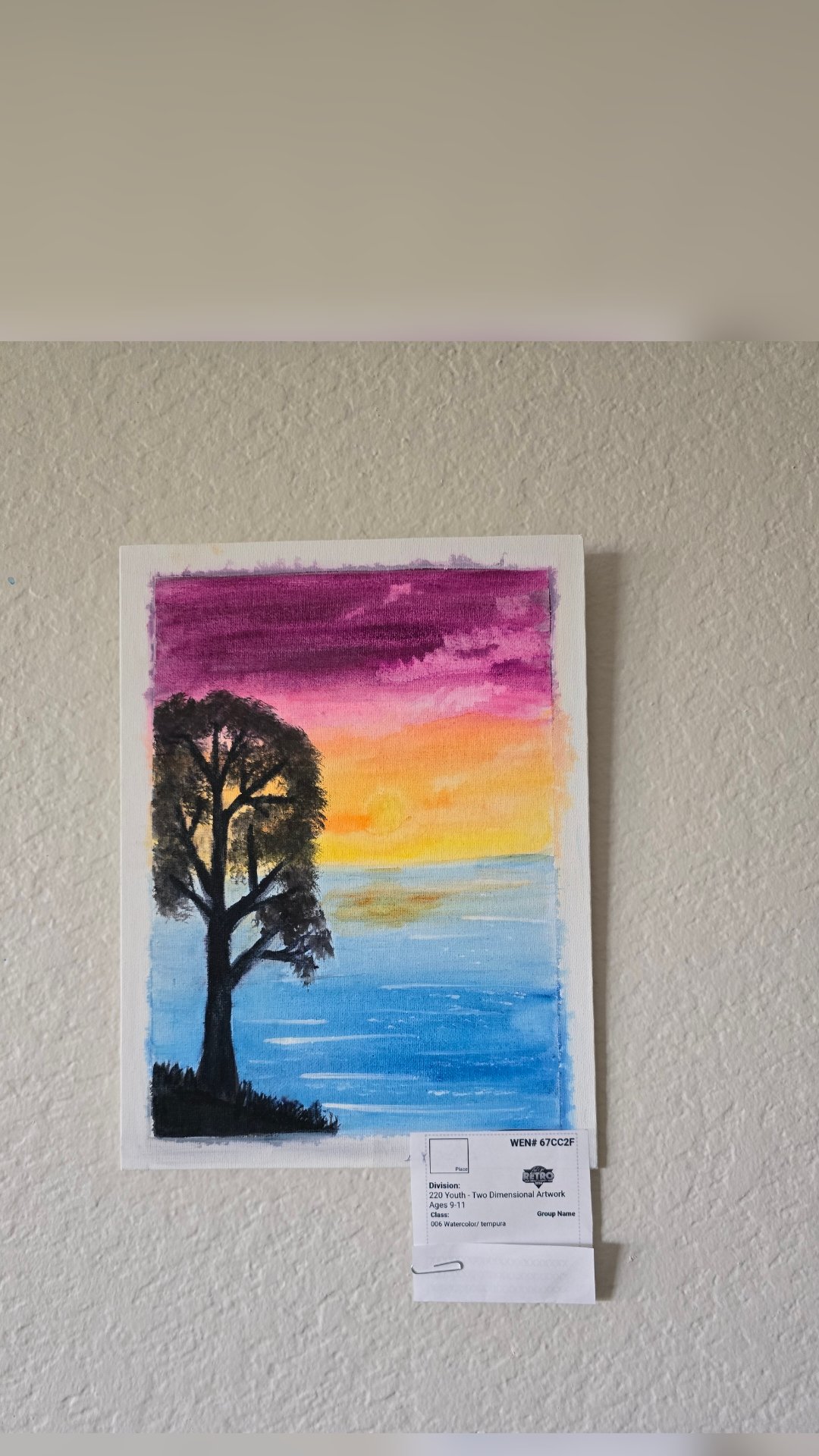
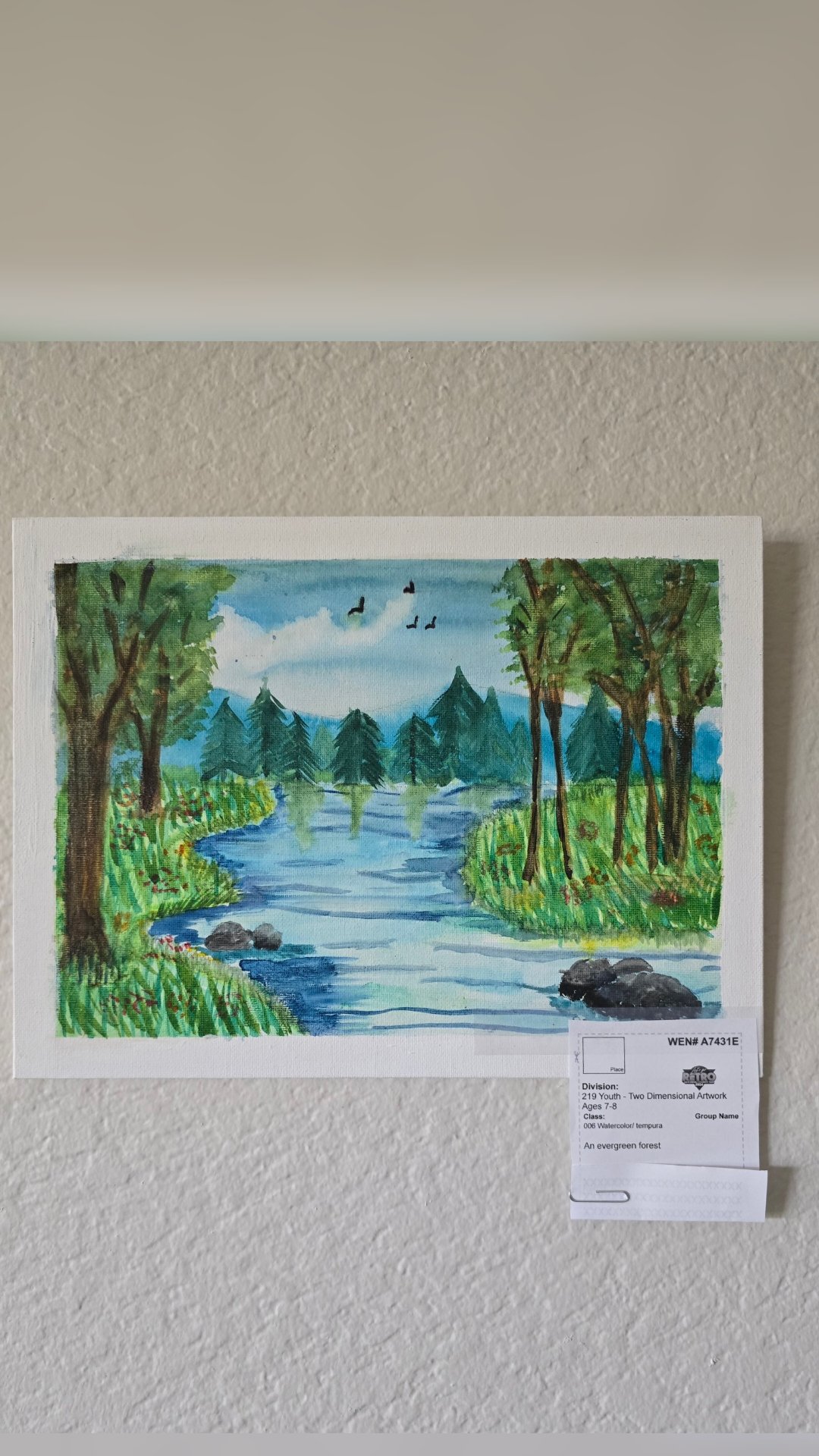
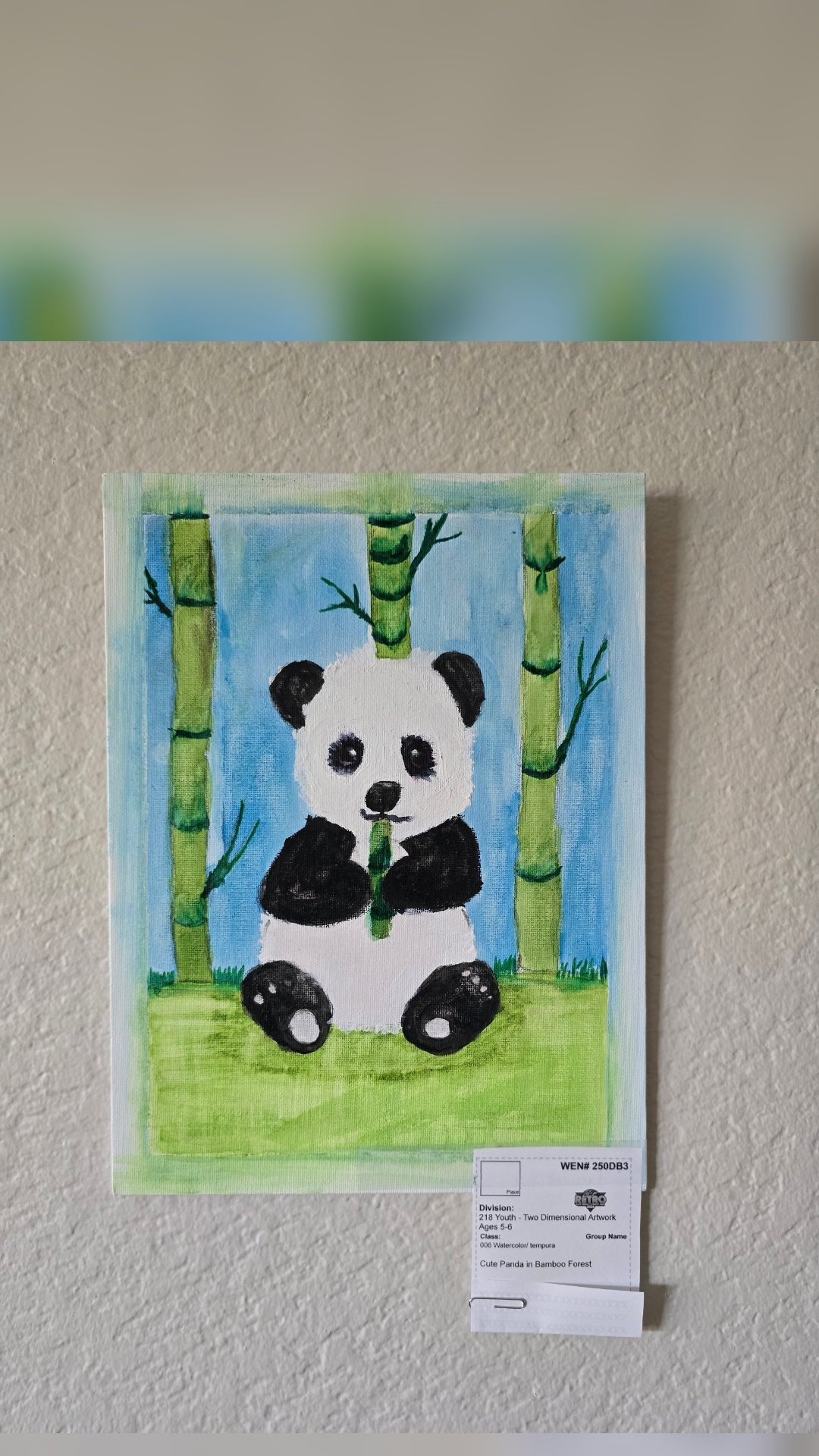
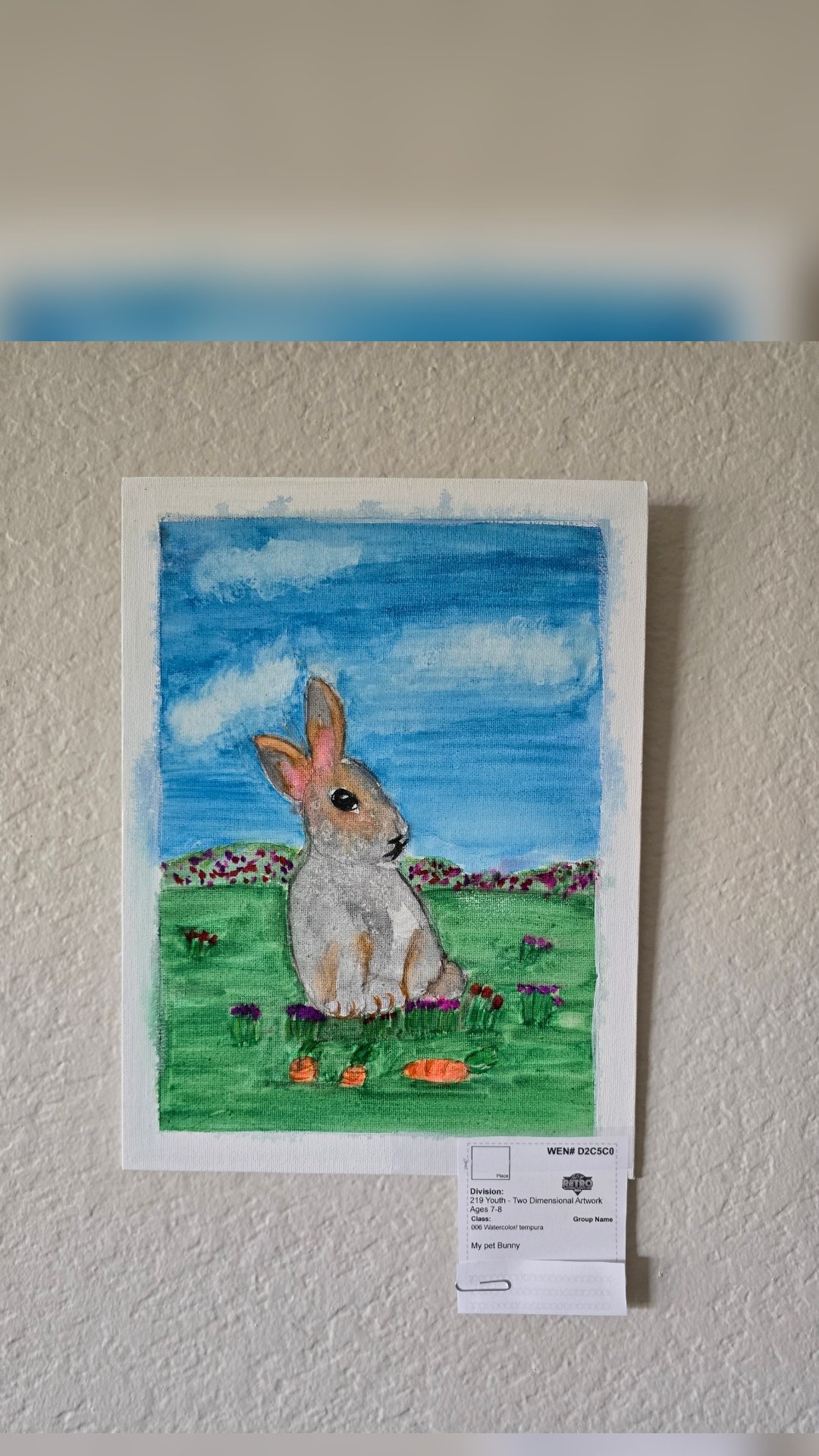
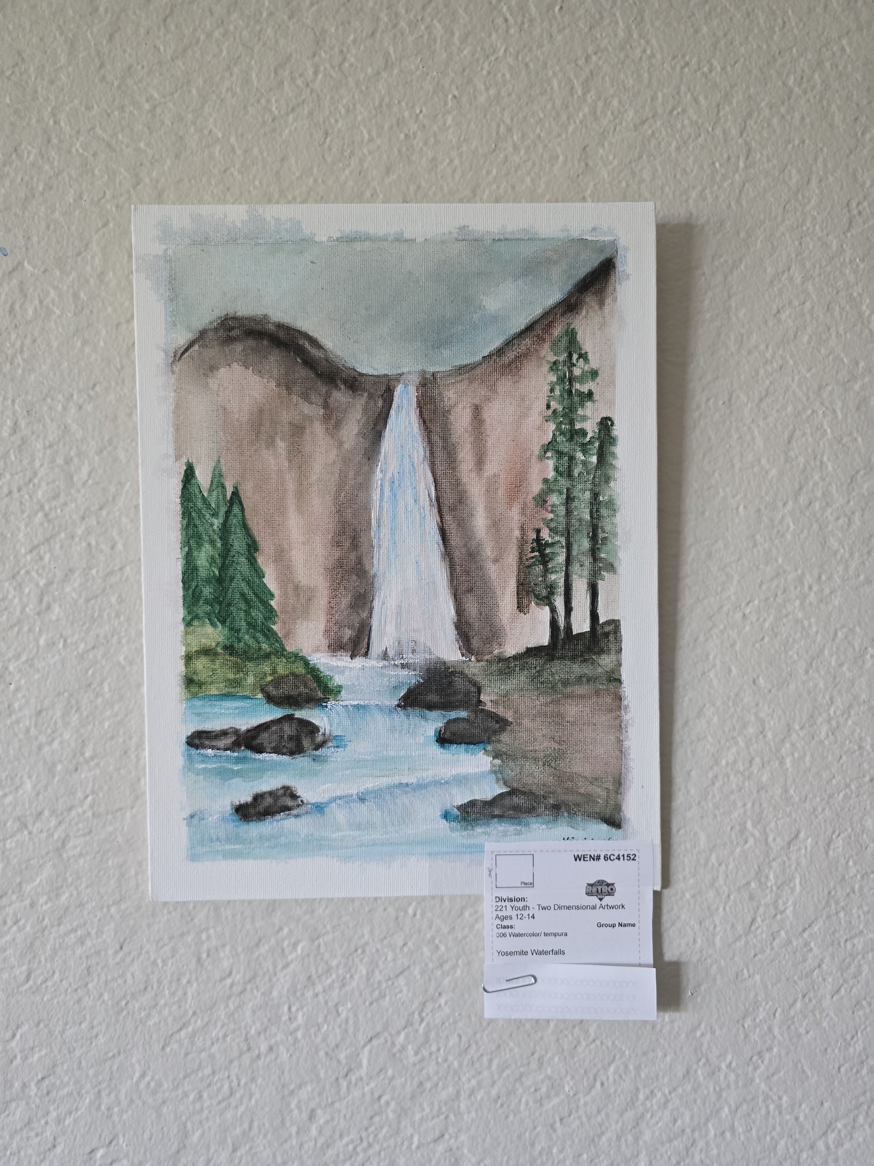
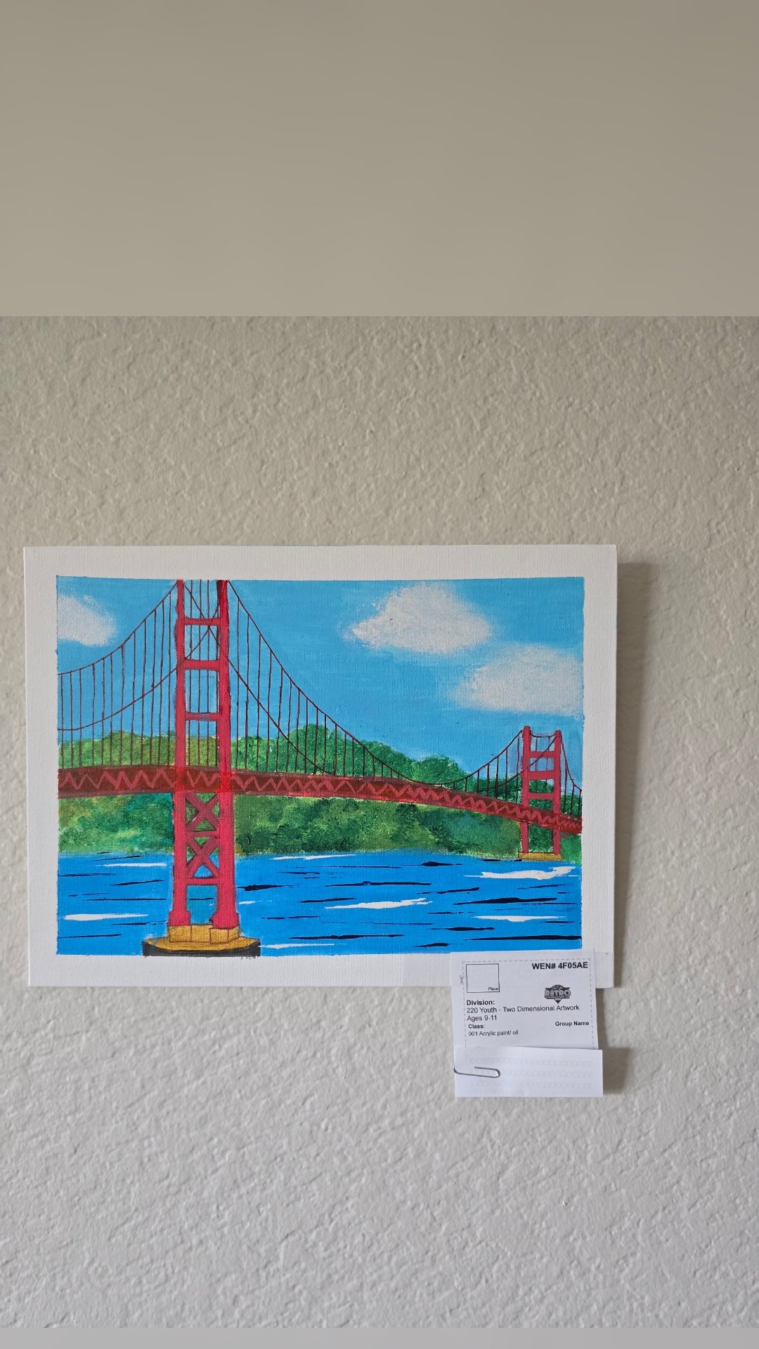
We are excited to participate in the San Diego County fair Youth 2D- art exhibition. We have 20 entries, by 19 students, and I am proud of the work they have exhibited.
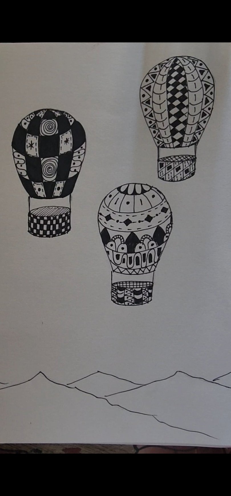
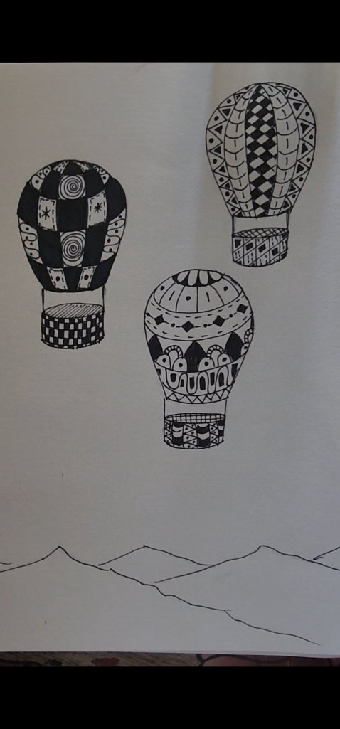
In this lesson, we will create a beautiful landscape with Hot Air balloons in the sky, and the balloons decorated in Zentangle style.
What is Zentangle?
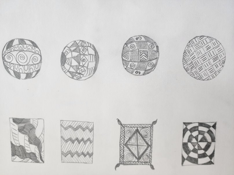
Zentangle is a form of art where we add lines and patterns in a conscious manner to create a beautiful pattern. It is a great way to increase your creativity, hand-eye concentration and practice your fine motor skills. Below you will find 8 simple Zentangle patterns I drew. You can try some ideas on your own too! If you look carefully there are different types of straight and curved lines, some basic C and S strokes, and some dots, dashes, and circles. Add them in different combinations and you have created your Zentangles!
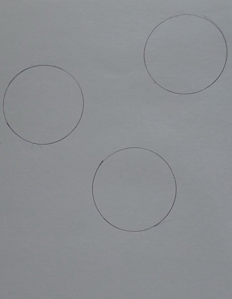
Let’s Start our Hot Air Balloon Drawing Project
Things Needed:
Step-by-Step Process:
2. Now extend lines from the sides of the circle to make the shape of a hot air balloon as shown in the picture.
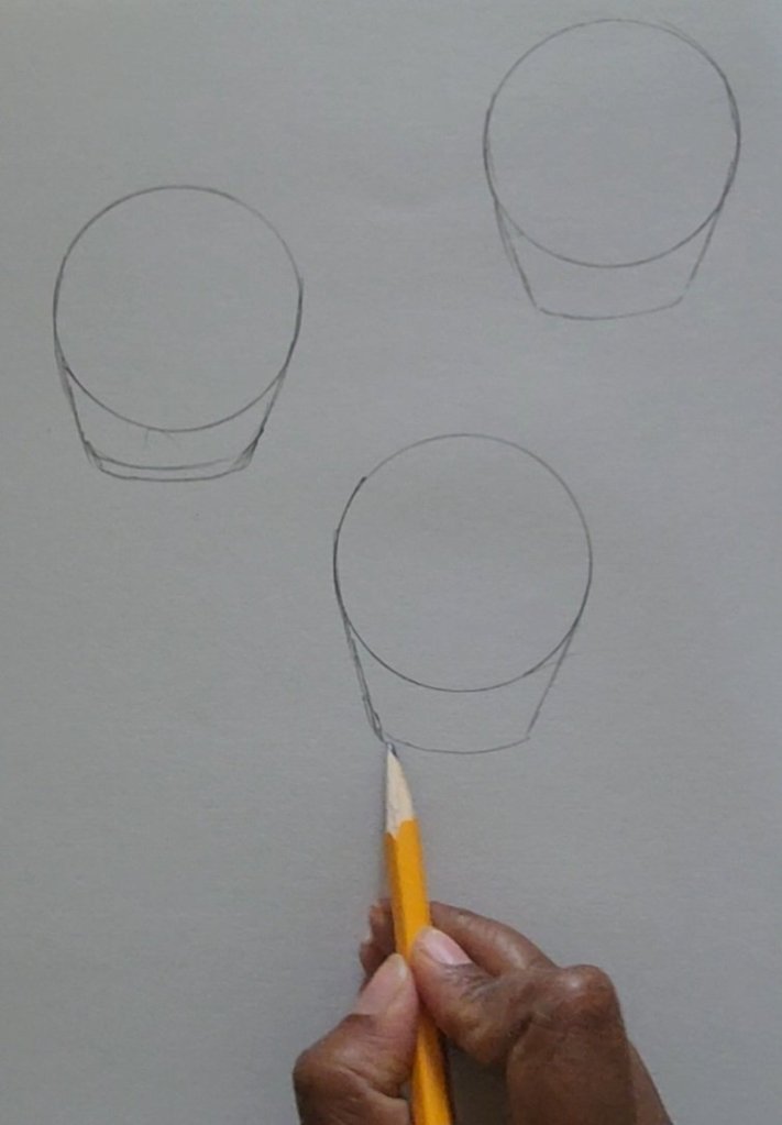
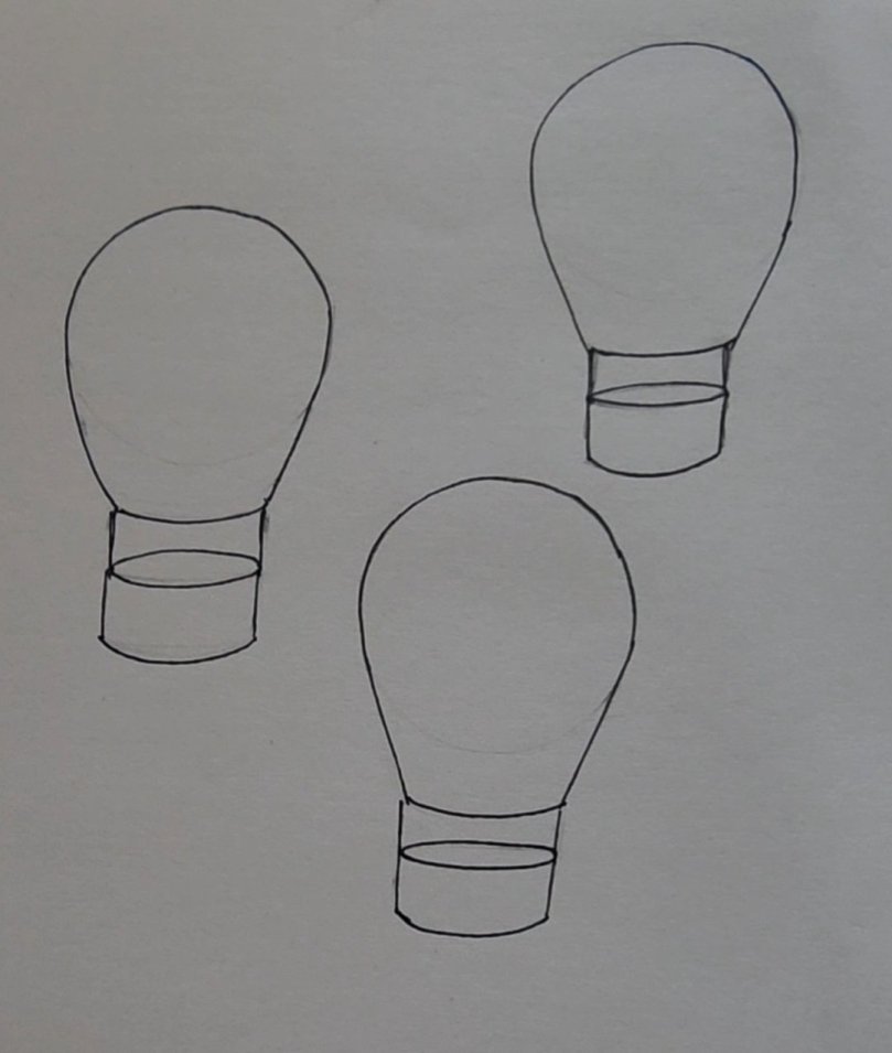
3. Next draw baskets for each of the balloons.
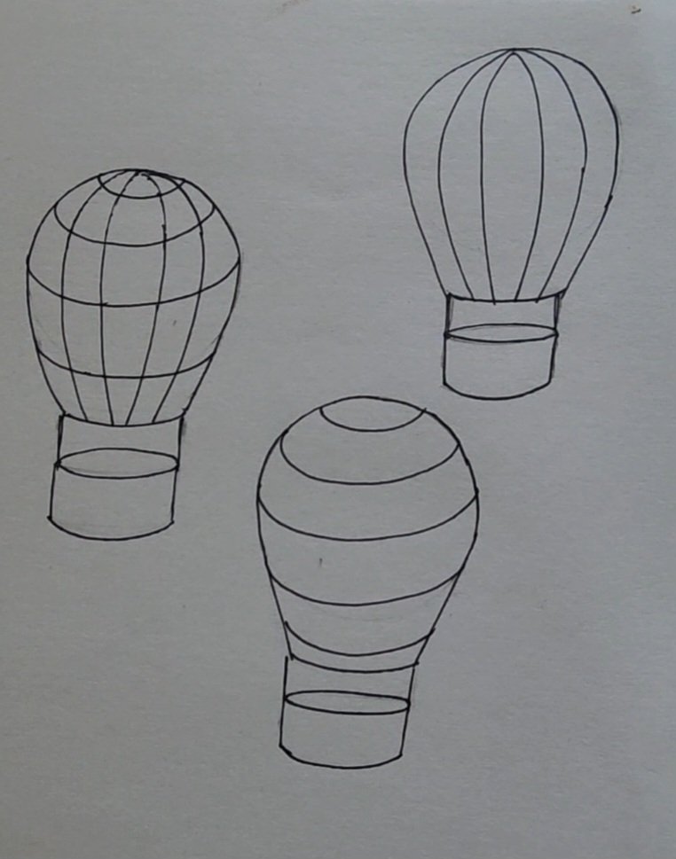
4. Next give a 3-dimensional form to the balloons by adding contour and cross-contour lines as shown below.
5. Now, it is time to let your creativity flow and add your zentangle patterns.
6. Finally, finish your landscape by coloring the background and negative spaces with watercolors or any medium of your choice.
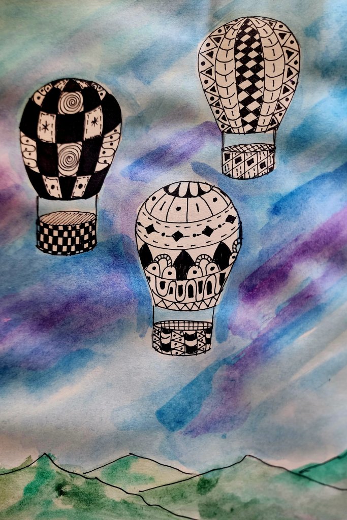
Your artwork is ready to display!!
If you are not much of a reader and would rather watch a video, follow along with this Youtube step-by-step video:

Colored pencils are a great medium for any beginner artist and they can create phenomenal results when used properly.
I have had a lot of parents showing frustration that when their kids use them, the colors do not seem to be bright and it is not easy for them to blend it together or even just color it smoothly without avoiding all the white spaces. The pigments in the colored pencils are generally held together using wax or oil. But usually, the colored pencils that are made for kids are made with hard wax, and hence it’s not so easy to lay down colors so easily. But at the same time, it is much easier to maintain compared to the Softcore wax-based more expensive oil pastels. The soft-core colored pencils do have the ability to blend better and it is easier to lay down the colors. But if not handled properly, it is much more brittle.
For blending and applying different techniques, the type of paper you use is also important. We do want the paper to have some tooth so that it can hold multiple layers of colors when blending but at the same time a paper that’s too rough is also not so good because that may leave a lot of gaps when you color and add details.
You can also use a colorless blending pencil to get a smooth blended effect on colored pencils. Wax or oil-based colored pencils could also be blended with baby oil while watercolor pencils can be blended using water( Read about watercolor pencils hereWatercolor Pencils for Little artists! ) But in this post, we will be discussing some basic beginner wax-based colored pencils. The color pencil I used here are Prismacolor Premier Soft Corepencilshttps://www.amazon.com/dp/B000C6RCD0/ref=cm_sw_em_r_mt_dp_EsnEFbC3472KH
Colored Pencil Techniques
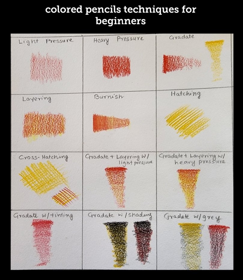
Colored pencils can give very different results based on the amount of pressure you apply. Coloring with light pressure will give a different effect compared to coloring with heavy pressure. So that’s what the first 3 techniques are:
2. Heavy Pressure- Coloring with heavy pressure
3. Gradate- Start with heavy pressure and lighten the pressure as you go forward
The next couple of techniques are when we layer or blend multiple colors to create different effects
4. Layering- Start with a dark color and layer on top with a lighter color
5. Burnish -Gradate+ Layering +blending with eraser. Use gradate technique, layer with colors, and blend it with an eraser or a colorless blender
6. Hatching
Colored with straight line strokes
7. Cross Hatching
Hatching in vertical and horizontal lines
8. Gradate+ Layering with Light Pressure
Use gradate technique and then blend in a lighter color with light pressure
9. Gradate+ Layering with Heavy Pressure
Use gradate technique and then blend in a lighter color with heavy pressure
10. Gradate with Tinting
Gradate and then layer with white
11. Gradate with Shading
Gradate with black and layer with another color
12. Gradate with Grey
Gradate and then layer with gray
To practice, and learn each of these techniques follow the link to my YouTube Video and color with me step-by-step:
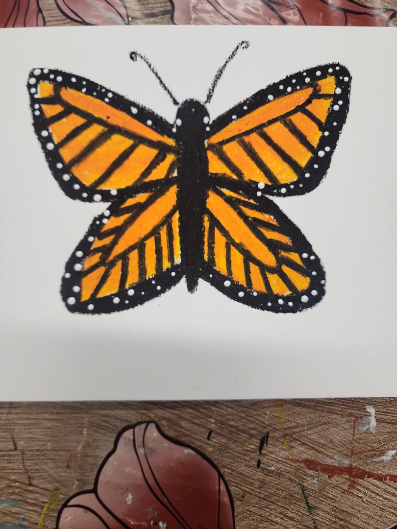
Medium: Oil Pastels and white acrylic Paint on Mixed-Media paper
Who doesn’t like a Monarch Butterfly? So many of the kindergarteners and first graders must have learned about them in their classroom while observing the life cycle and ultimately seen them hatching out of their cocoons! Well, I am not here right now for giving a science lesson, but I remember my kids used to love those National Geographic books about animals when they were little, and look what I found…an online link to it! So, why not read about it with your kids and have fun drawing them too!!
https://kids.nationalgeographic.com/animals/invertebrates/facts/monarch-butterfly
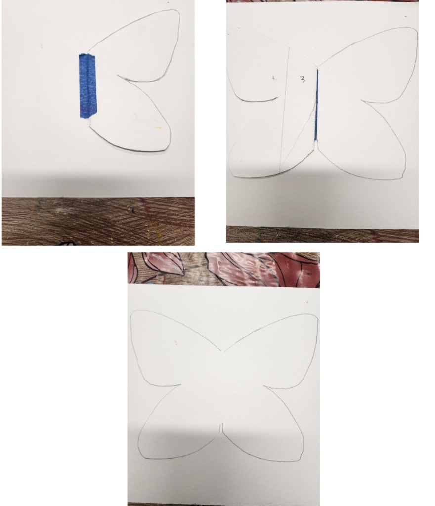
Let’s start with the materials required for the drawing:
Step-by-step Process
2. Place your stencil on the paper towards the left and draw the left side of the wing, next turn it to the right side to draw the right side of the wings as shown in the picture. You could stick your stencil on the paper with masking tape before drawing so that it stays in place.
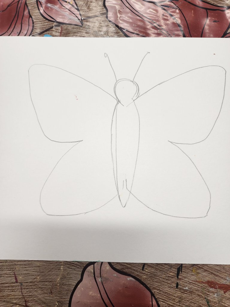
Next, draw the rest of the body and the antennae.
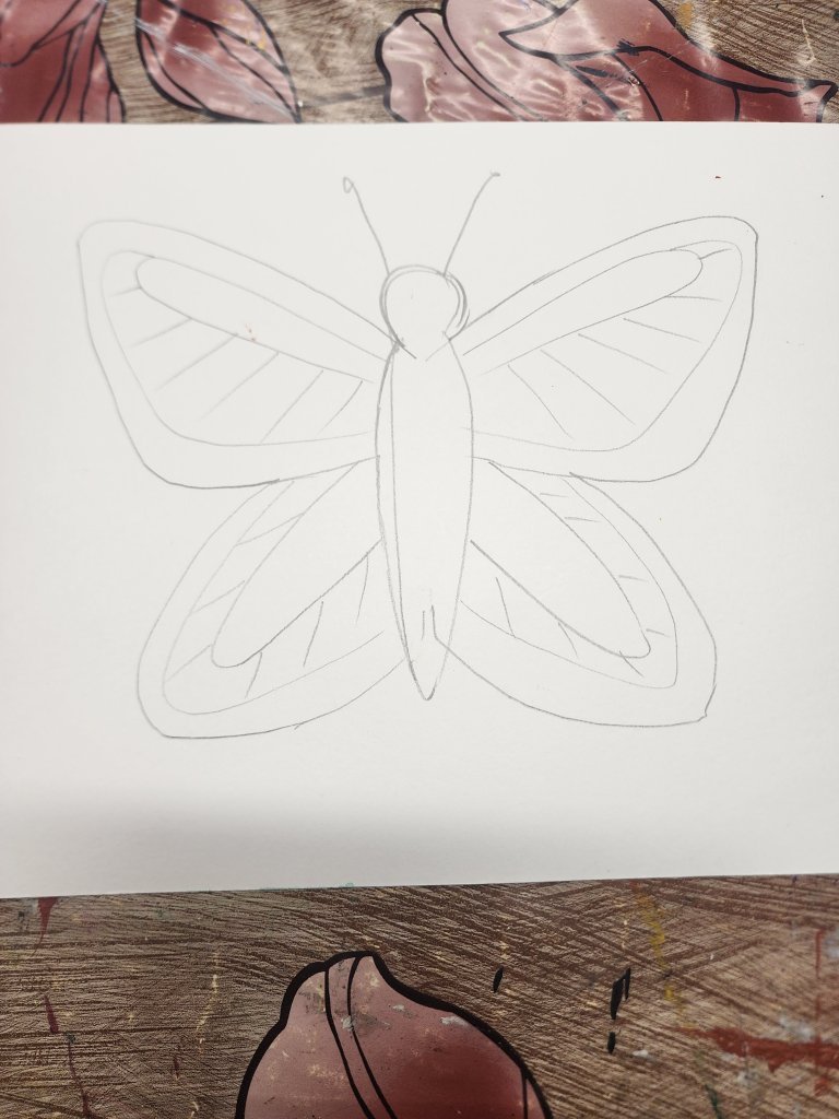
4. Now it’s time to add the patterns on the butterfly wings to create a Monarch.
5. Color the inside of the butterfly with a yellow-orange oil Pastel. Next thickly outline the patterns and the outer edges with a black Oil Pastel.
6. Finally, add details on the corners with white Acrylic paint pens OR acrylic paint and the back of a thin paintbrush.

If you would like to watch the step-by-step video follow the YouTube Video. Have Fun!!
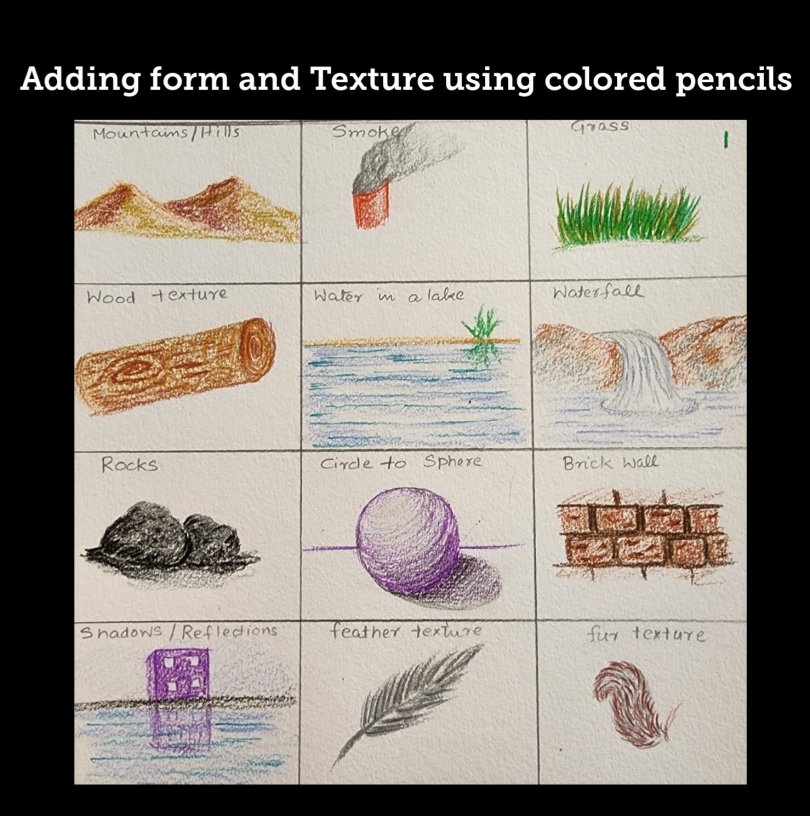
Texture is one of the key elements of art. The texture is how an object feels when you touch it. Like a prickly feeling of a thorn or the soft feel of your comforter. Learning to visually create this feeling will help an artist create a successful drawing or painting.
In this post, we are going to learn techniques to create visual texture for 12 different things using colored pencils.
There are various elements of art that we can use to create visual texture:
1. Using soft and thick lines
2. Contouring and cross contouring to create a form in turn, creating an illusion of texture.
3. Hatching and cross-hatching lines
4. Using different strokes like stippling, flicking, circular motion, etc
5. Using Patterns ( for example, the pattern that a brick wall might follow)
Please follow the video below to see step-by-step to create 12 different textures using colored pencils:


In this lesson, we will learn to make a Color wheel with Primary, Secondary, and Tertiary colors. We will also learn about the Complementary and analogous Color groups as they play an important role in deciding your art composition.
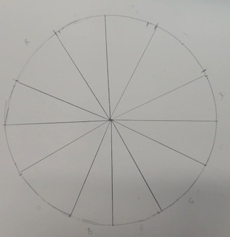
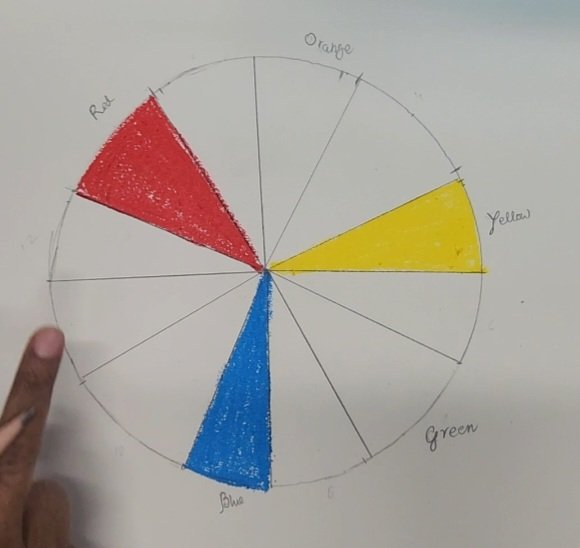
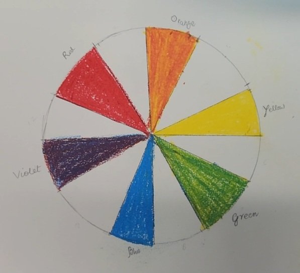
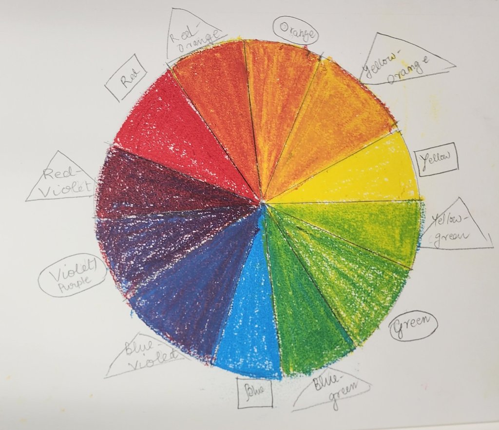
Let’s first start by understanding Primary, Secondary, and Tertiary colors. We will use three colors from our color pencil set to understand our terms-Red, Yellow, and Blue. First, to create a color wheel template we will divide a circle into 12 parts( 12 triangles).
Primary Colors- Primary colors are the most important in a painter’s palette because these are hues that cannot be created or derived by mixing other colors. The Primary colors in a color wheel are Red, Yellow, and Blue. If you have these three colors you can mix them in different amounts to create different colors.
Secondary Colors-Secondary Colors are colors that can be created by mixing equal amounts of two Primary colors. Red+Yellow=ORANGE, Yellow+Blue=GREEN, and Blue+Red=PURPLE are the three Secondary Colors on the Color wheel.
Tertiary Colors-Tertiary colors are created by mixing equal amounts of Primary color with a secondary color. Red+Orange=RED-ORANGE, Blue+Orange=BLUE-ORANGE, Blue+Green =BLUE-GREEN, Yellow+Green=YELLOW-GREEN, Yellow+Orange=YELLOW-ORANGE, and Red+Purple=RED-PURPLE are the six Tertiary colors.
Next, let’s talk about Complementary and Analogous colors.
Complementary colors are colors that are on opposite sides of the color wheel.
Analogous colors are a set of three colors that are next to each other on the color wheel usually a primary color and a secondary and tertiary color that sits right next to it.
Complementary color schemes create a highly contrasting composition, whereas analogous color scheme creates a composition with low contrast.
Color temperature is also another aspect where simply by looking at the colors we have a sense of warmth or cold. For example, when you look at the colors Red, Orange or Yellow you sense the hot sun, making these warm colors. Similarly, when you look at blue or green you might have a feeling of a cool sea breeze or cool grass which makes these Cool Colors. So when you have different hues, the hue which has more of the warm colors mixed will feel warmer and vice-versa. So a hue of violet or purple will feel more toward the warm spectrum if it has more red, whereas if it has more blue in it it will feel cooler.
Watch this video step-by-step to learn to make an easy color wheel using oil pastels
The colors being mixed with white, black, and grey also create different Hues, tints, shades, and saturation. To learn more about this, please refer to the previous post-https://nishasartforkids.com/2022/11/04/what-is-color-lesson-1-in-color-element-of-art/
In this lesson, we will draw 12 things using Prismacolor colored pencils for beginners/kids. These are things that we would use a lot for our drawings, and these techniques will help us add form and texture to make our drawings look realistic.
The 12 things that we are going to learn to draw in this lesson are:
We will use the techniques we learned in our previous lesson( https://nishasartforkids.com/2022/11/10/colored-pencils-techniques-for-beginners-lesson-1/)
to color along the form of the object, applying different amounts of pressure while coloring.
Please follow the link for the step-by-step video lesson to create each of these different objects:
We see color when light waves are reflected from an object. When light falls on an object, the wave spectrum that is reflected back is the color of the object. Some objects are black because instead of reflecting it absorbs all the colors! Black is basically the absence of color. Similarly, an object is white when it reflects all the colors.
Colors can be described in 3 different ways: Hue, Saturation, and Value or intensity.
Hue- Hue is another name for a color. It is the dominant color, for example, you might see the names Prussian Blue, Cadmium Blue, and cobalt blue on your Blue paint tube but on all of these the key name or the color is BLUE or the hue is BLUE!
Saturation- The saturation of a color is determined by how bright or dull a color looks. It can be determined by the amount of grey in a color. A highly saturated color will have mostly white mixed whereas a low saturation will have a more grey mix.
Value or Intensity- Value is determined by the darkness or lightness of a color. When you add black to a color it creates a shade whereas adding white creates a Tint. Depending on the amount of black or white you add the color gets a lighter value or darker value.
We are going to do an exercise next where we will get a RED hue and then create different values and Saturation. We will be using acrylic paint for this.
The colors we will use are RED, GREY, BLACK, and WHITE.
The first thing we will create is a value chart of red. We will make seven squares. The middle square will be pure Red, and on the left, we will have different tints of red by adding different amounts of black( remember Black is a very strong color, so a tiny drop goes a long way).
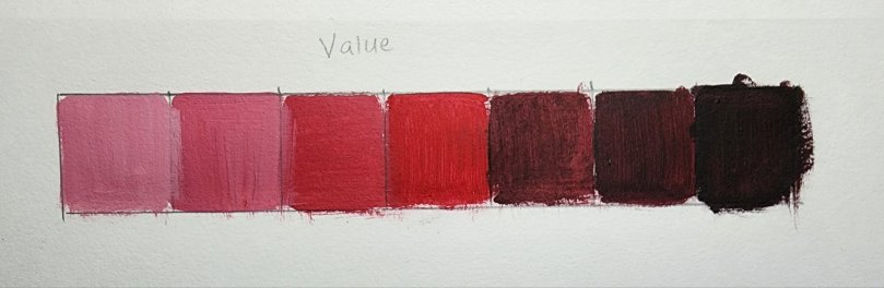
Check out this step-by-step video to check out how to make the value scale:
Next, we will create a Saturation chart with 7 boxes. We will start by mixing grey and red together. As we move to the right side of our chart we will keep adding tiny amounts of white until it’s mostly a mix of red and white( making it highly saturated).
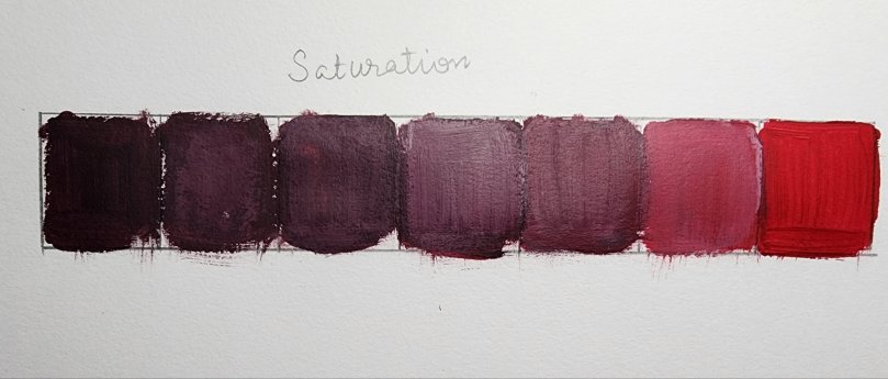
If you need help creating the saturation scale, watch the video and follow along:
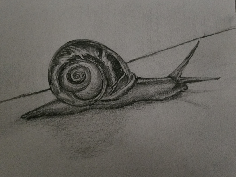
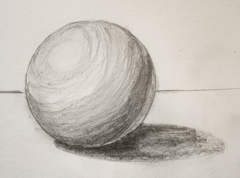
In the last two posts on Form, we learned to create dimensions on simple and geometric shapes. In this lesson, we will try adding a form to a more organic shape.
The first step to drawing anything is to identify the shape of the object and try to replicate it on paper either using contour drawing or by combining simple shapes together. Once we have the outline, the next step would be to create a form so that the object doesn’t look flat. Think of yourself as a sculptor creating an object and how his hands would be moving to create the shape. Your pencil will move in that direction and do the same thing for you on your drawing surface.
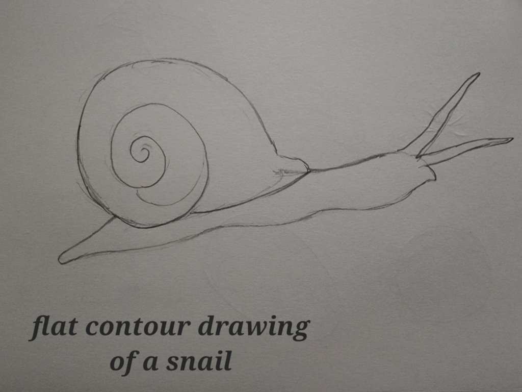
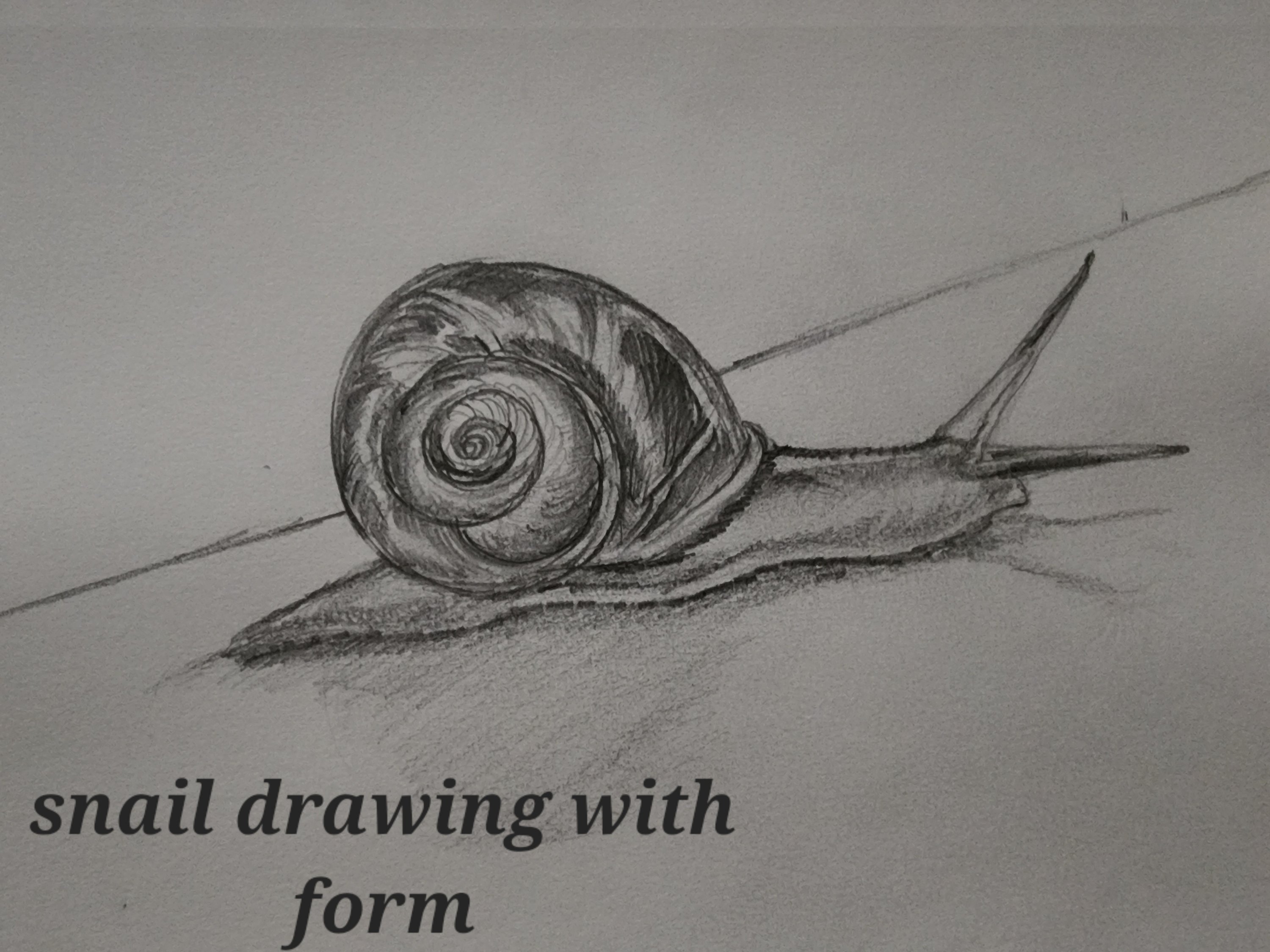
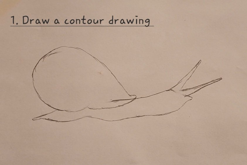
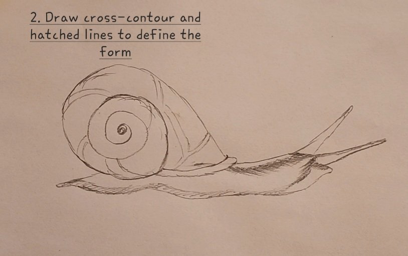
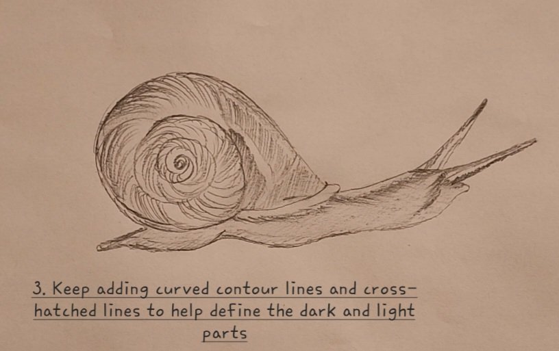
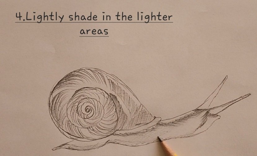
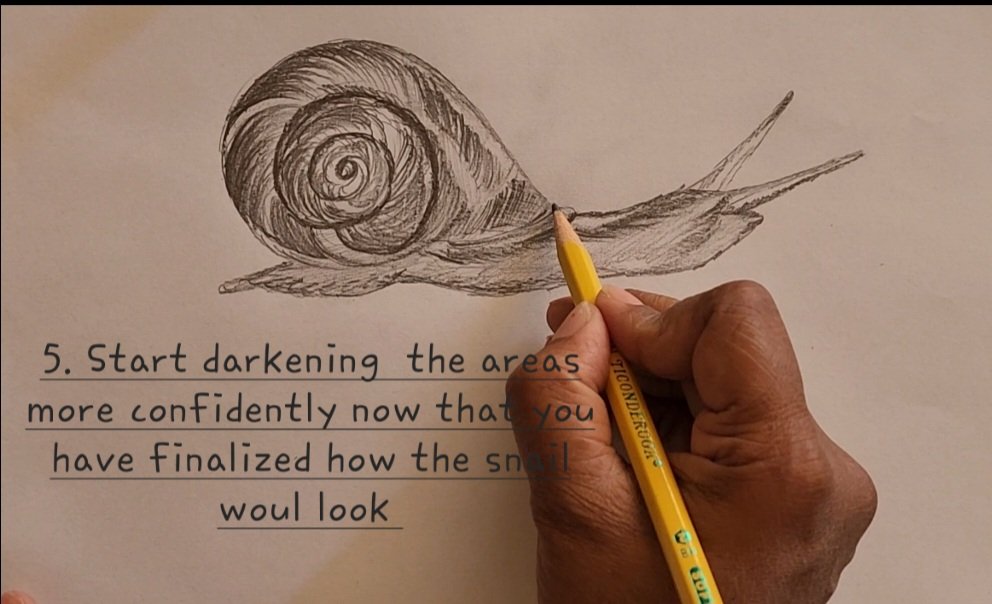
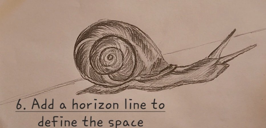
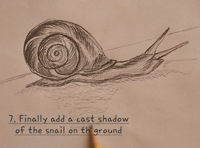
In this exercise, we will draw a snail and then we will give it a 3- dimensional form. We will use contour and cross-contour lines, we will add shades and highlight, and add texture to do so.
Please look at the photograph below of a snail and observe how the lines move. Observation is the key to create a sucessful form. You can also follow step-step video linked below.
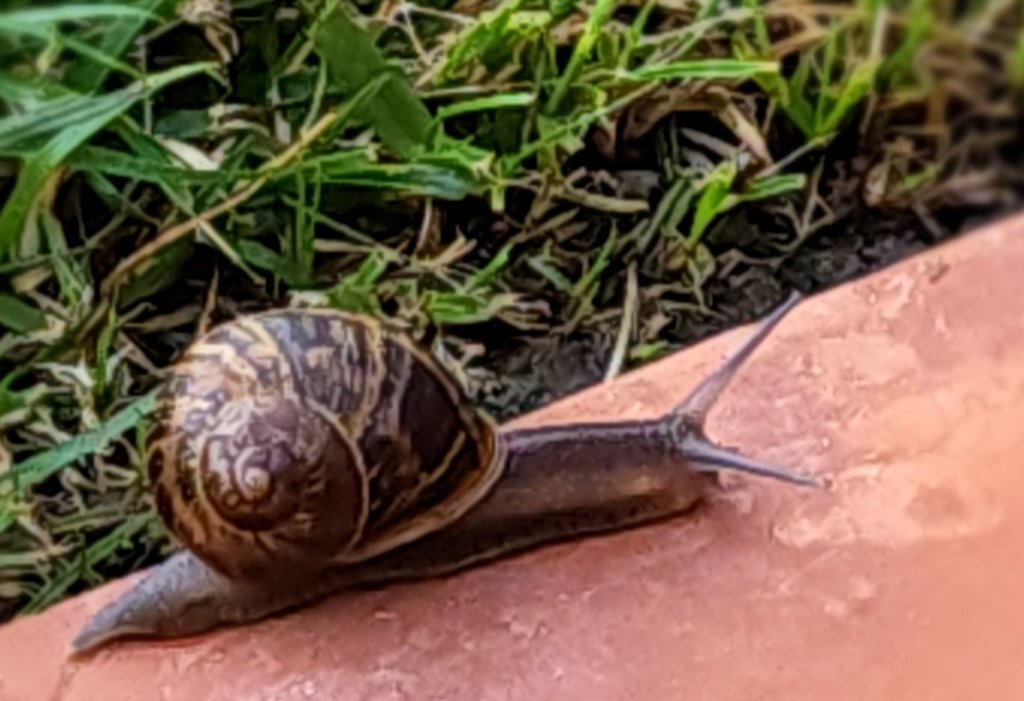
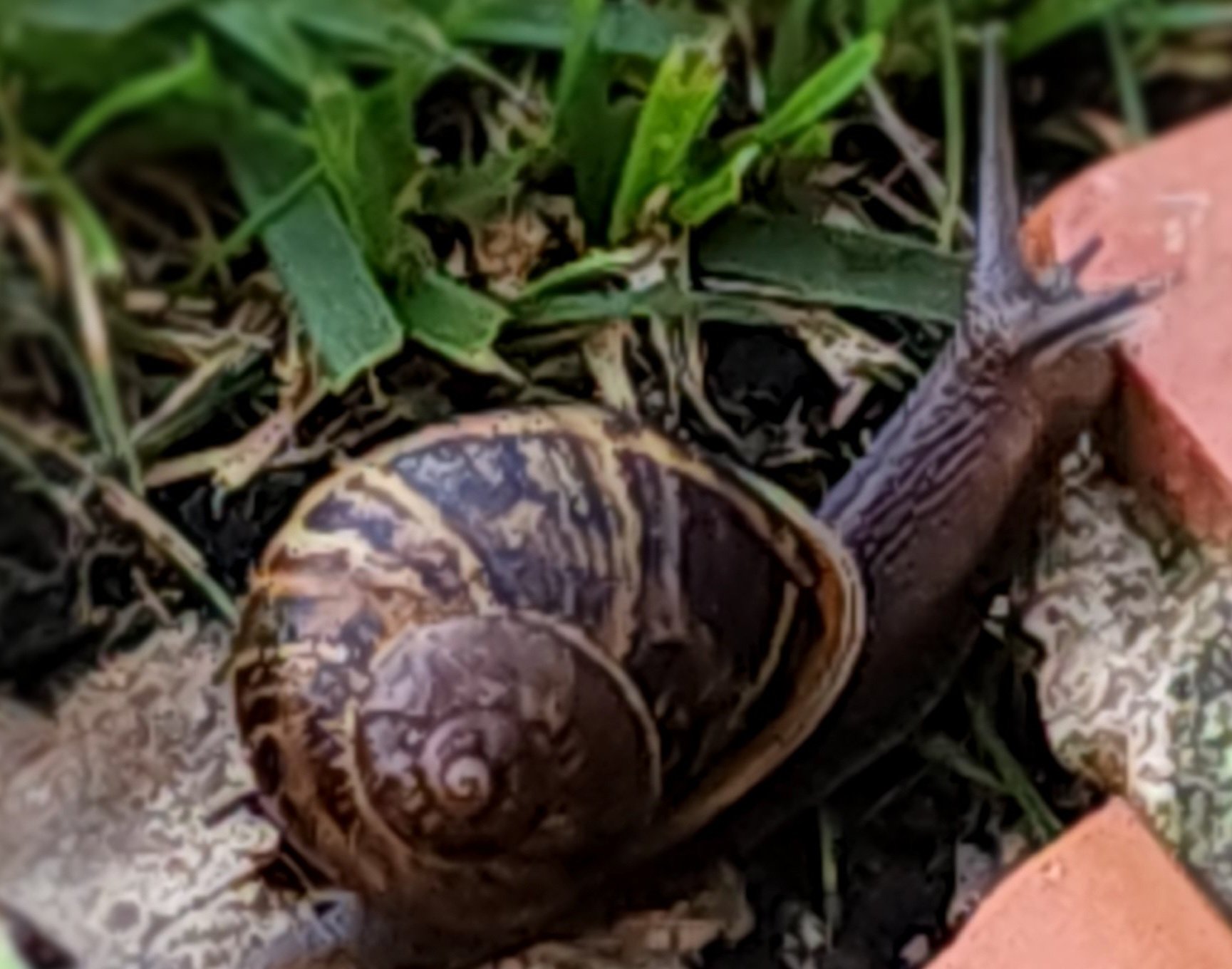
When we start drawing we will do a basic contour drawing first. Then we begin by adding cross- contour lines, add a horizon line, then add shadows and highlights using hatched and cross-hatched lines and start seeing the transformation from a flat object to an organic form. Observe the difference between figure 1 and 2 below
FOLLOW THE STEPS BELOW OR WATCH THE VIDEO ON YOUTUBE TO DRAW:
Please watch below for video lesson, don’t forget to subscribe to the channel!

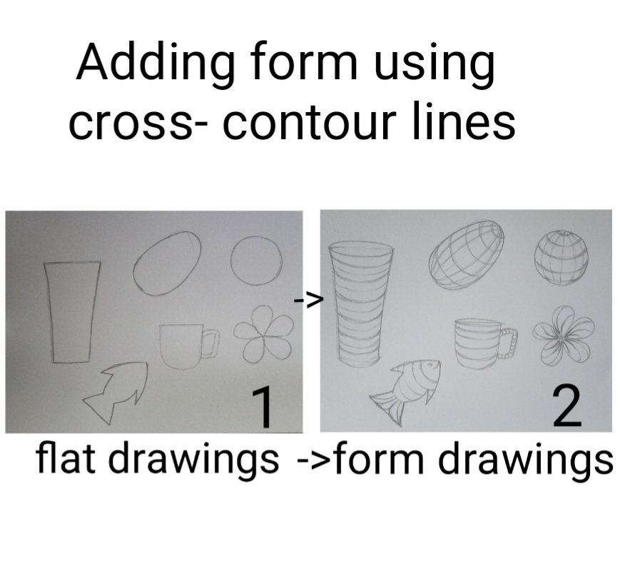
In this lesson, we will learn about contour and cross-contour lines, and how they can be used to create form and depth in our drawing. We will first try to understand the meaning of contour and cross contour lines before doing our exercise.
Contour Lines- Contour line is the outline of a drawing without any shading or details. Practicing to draw your object using contour lines is important as it greatly improves your hand-eye coordination because your eye needs to focus on the object whereas your hand needs to draw it on the paper at the same time.
Cross-contour lines- cross- Contour lines are lines that moves across the object that we are drawing. It is the direction that our eye moves when you look at an object. Cross- contour lines helps create an illusion of dimension and form to an object.
In this exercise we will give form to various flat 2 dimensional objects. We will do that by creating contour drawings of objects and then we we draw cros-contour lines across to create form.
Start by drawing outlines of various objects as show in the image below:
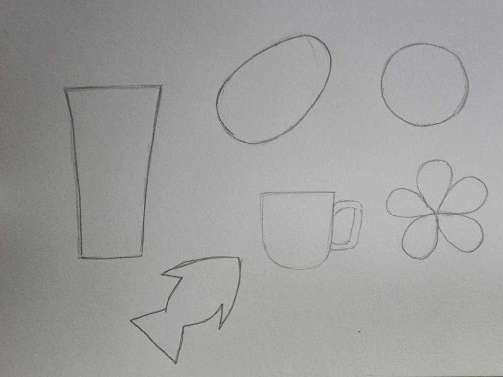
In the next step try to visualize how the objects look in reality and in which direction the eyes move when you look at them. Now try drawing lines along your visualization. The drawings would look some what like the image below:
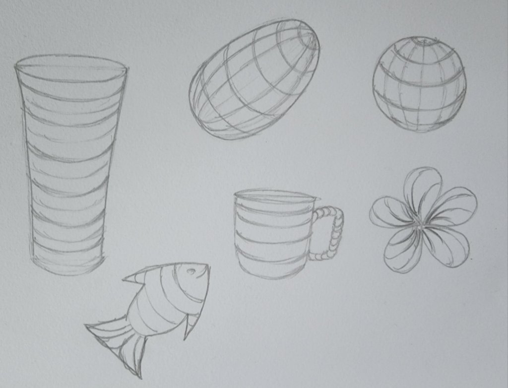
You can see how the circle looks like a ball, the oval takes the shape of an egg and so on. You have successfully added form to your objects!
In our last lesson on space, we created an illusion of form using shading to define a sphere’s space.
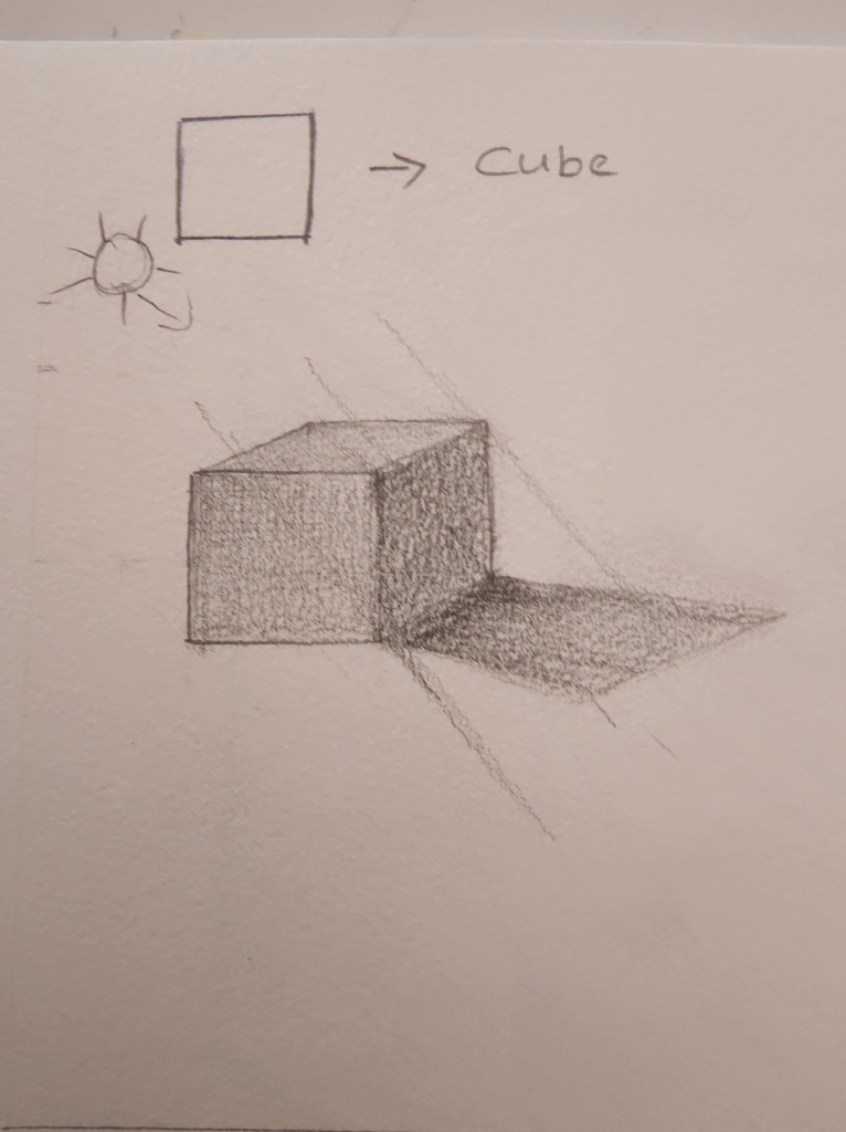
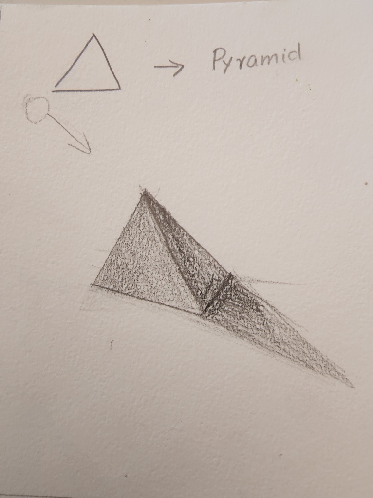
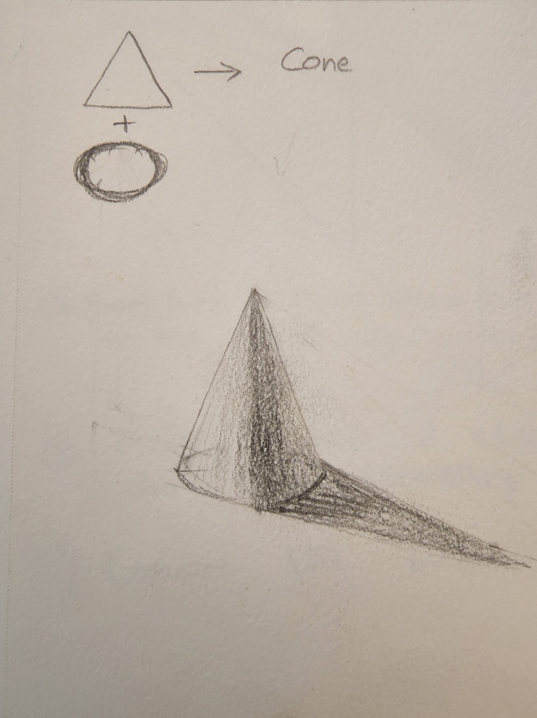
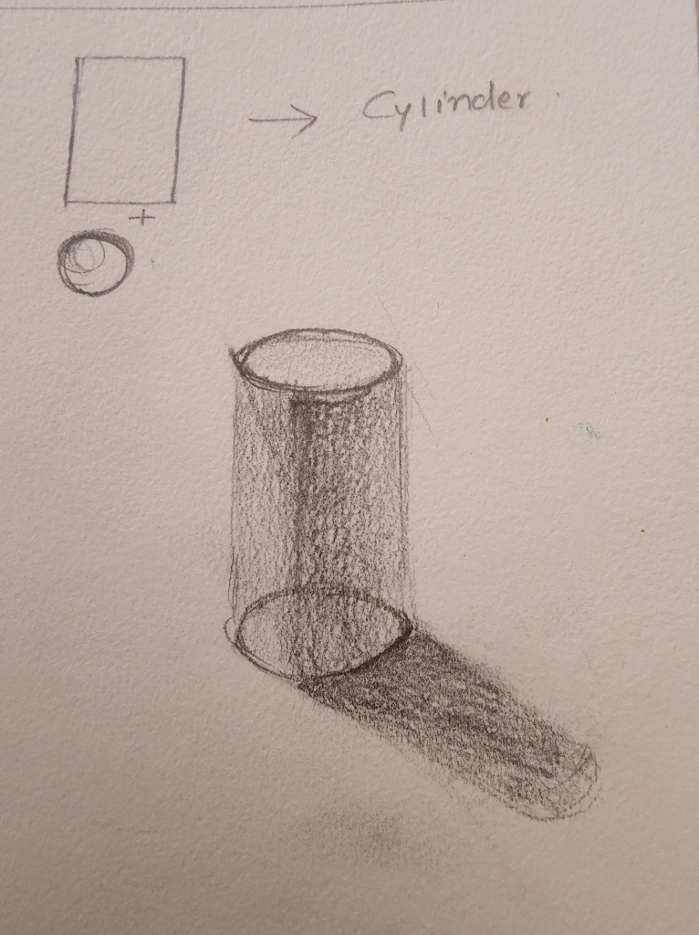
In this lesson, we are going to see how different shapes are going to be combined to create a 3-dimensional form.
We will be working with the geometric shapes square, rectangle, oval, circle, and triangle and combining them to create a pyramid, cone, cube/cuboid, and cylinder.
In the next step, we will add shadows like we did in our previous exercise to define its space and give the shapes Form.
THINGS NEEDED:
It is a drawing exercise, so all you are going to need is a well-sharpened pencil, eraser, and drawing paper. You could use a ruler if you are not confident about your free-hand straight lines.

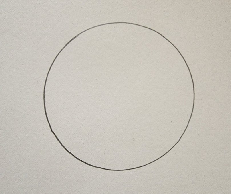
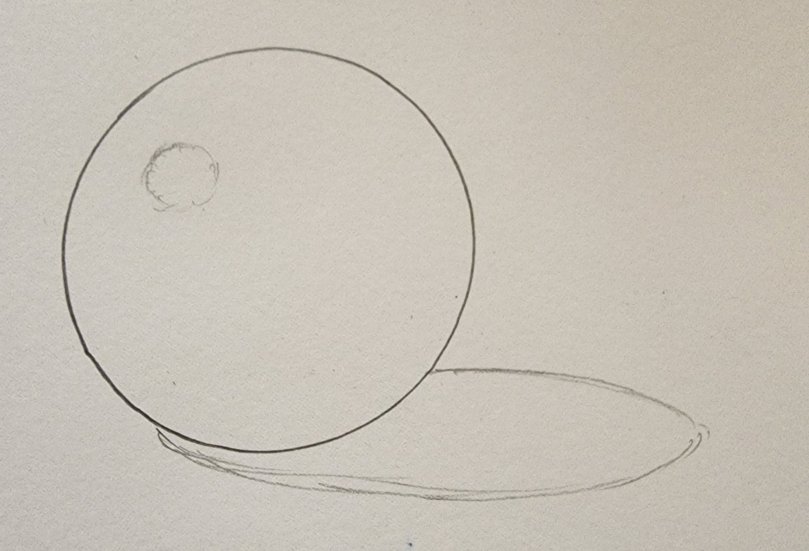
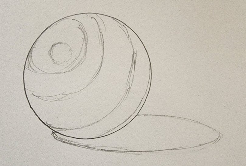
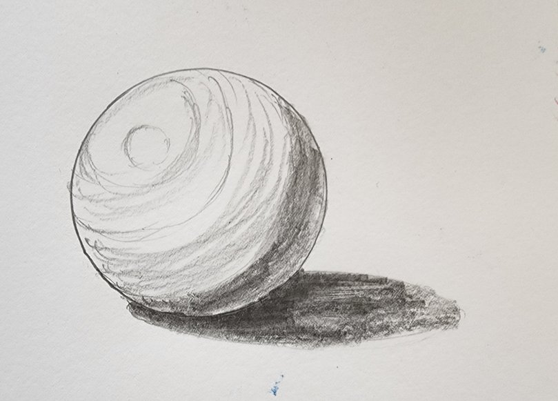
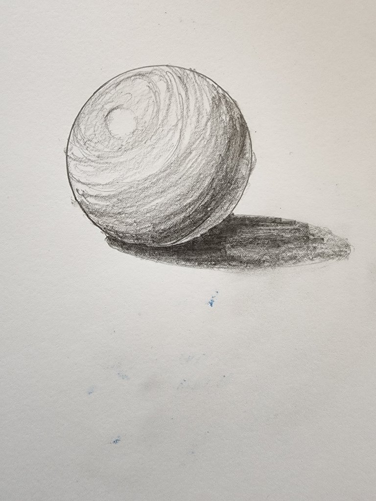
Adding shadows and reflections to objects is one of the ways to define the space where the subject of your art is placed. We are going to add shadows to turn a circle into a sphere.
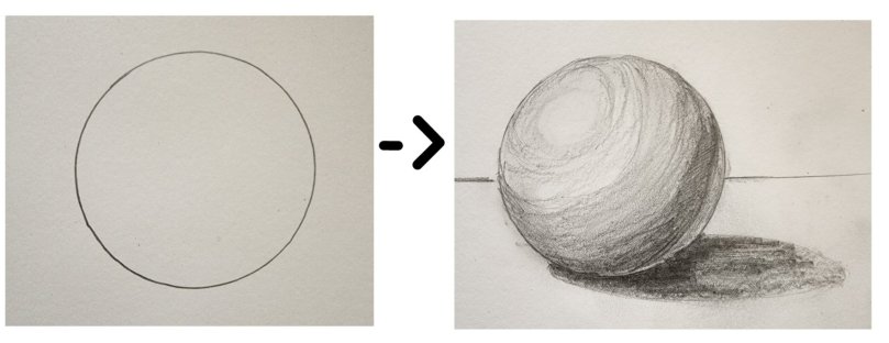
Look at the slideshow below to see step-by-step how adding shadows can make a circle drawn on a flat piece of paper can make it look like a spherical object.
Next, let’s get to know the names of the different shadows that are on the space which define the circle as a sphere.
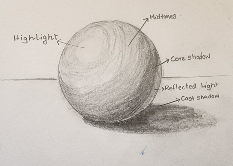
Highlights- The highlight is the lightest part of the object and it is actually a reflection of the light source.
Mid-tones- Midtones can be defined as the lighter areas of the shadow except for the highlight.
Core shadow- Core shadow is the darkest part of the shadow on the object.
Reflected Light- This is the shadow that is cast on the darkest part of the shadow by other objects around the subject of the drawing. It is lighter than the core shadow and darker than the mid-tones.
Cast Shadow- It is the shadow of the object on the opposite side of the light source and is usually cast on the ground or surface where the object is placed.
As you can see, adding the above shadows to a flat 2-Dimensional object transforms it and creates an illusion of a 3-dimensional form!